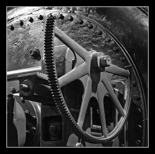
This image was taken at The Henry Ford Museum in Dearborn, Michigan. The museum has an enormous collection of interesting items ranging from very small to the very large. This image was taken in a section of the museum devoted to power generation and machines. The museum has several large generators, many of them steam operated, in it's collection.
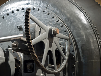
This particular image is a close up of one of the larger generators. I was attracted to it by the interesting gears it used as well as just the shear size of the thing. When I took the shot, I planned on converting the image to black & white. The machine itself, as you can see below, was primarily battleship gray, so there wasn't much color to begin with. There was a hint of color in the gears, either rust or exposed brass, but I didn't think that contributed much to the image.

The image to the left is the shot as it came out of the camera. I took this with an Olympus E-3 which has a 4/3 image factor. When I was working with the image, I felt that a squarer crop would work better. I decided the focus should be more on the gears which attracted me in the first place, so I trimmed the excess from the right side of the image.

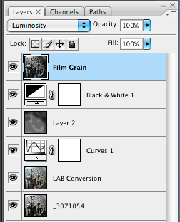
Here you can see the layers palette for the final image. I started with the image from Adobe Camera Raw and made minor adjustments before opening the file in Photoshop.
The next step was a bit of an experiment. I have seen some videos and have been reading a book by Dan Margulis on the LAB color mode. One of the strengths of LAB is the ability to separate similar colors. In my image I had some metallic tones which had more color variation than existed in the captured image. I decided to try a couple of simple LAB curves on the A and B channels to see if I could get more separation. I don' t have a before/after image to show you, but it did bring out some additional color. My thinking was that this might help increase the tonality in the conversion to black & white. Don't know if it worked, but it didn't hurt!
The next step was to perform a simple curves adjustment. Primarily I just increased the contrast a bit by using a slight S-curve. One thing this did was to darken the area behind the generator a little more so you don't really notice it.
After that, it was time to do some dodging and burning. I created a new layer, set to overlay, and filled with 50% gray. I used a soft brush at a low opacity to brush in some additional highlights and to darken some areas. In particular, I darkened the part of the generator in the background. I liked how it gave it a darker, almost oily appearance.
The next step was the actual black and white conversion. I started with the default settings and clicked in areas of the image that I wanted lighter or darker and move the mouse right or left as needed.
The final step was to add a layer to simulate film grain. Once again I used a technique described by Katrin Eismann for adding slightly blurred noise to each of the RGB channels independently, using Luminosity mode to remove any color side affects. With the addition of a border around the image, the result is what you see at the top of this article.
Comments, criticisms and questions welcome.


No comments:
Post a Comment