Tuesday, July 22, 2008

Monona Terrace


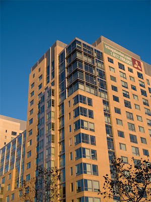
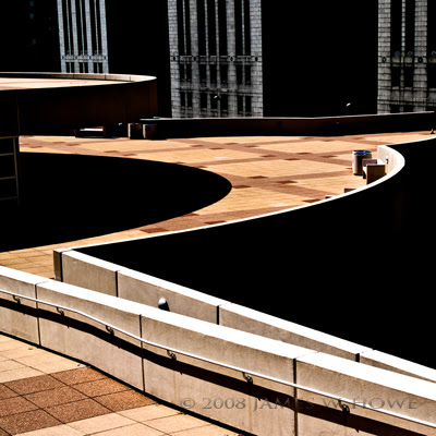
This is a shot taken from the top of Monona Terrace in Madison, Wisconsin. Monona Terrace was designed by Frank Lloyd Wright but never built in his lifetime. Several years ago the project was resurrected and built. The building itself is hard to photograph unless you are out in a boat on the lake. The rooftop has a great terrace which has wonderful views of Lake Monona to the southeast, and the capitol building to the north west. The terrace also has a walkway which leads directly out to downtown Madison and it's a short walk to the capitol.


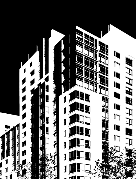
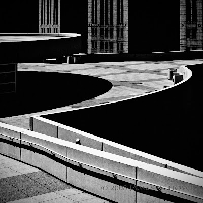
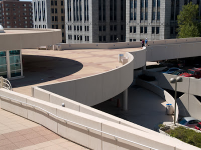
As you can see in 'as shot' image below, the original image was in color. I was trying to capture some of the lines and curves which make up the design of the building. I also liked the pattern in the pavement. My feeling is that while I may have captured some of the elements that I wanted, the raw image looks more like a snapshot than a finished work. There is visual competition from the parking lot/garage in the bottom right, people walking in the upper right and the buildings at the top. When I worked on this image, I wanted to reduce the clutter and make the image more about the lines and curves of Monona Terrace itself. I liked the buildings in the background, particularly since they are of a more 'traditional' design, but I wanted to de-emphasize them.


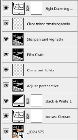
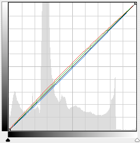
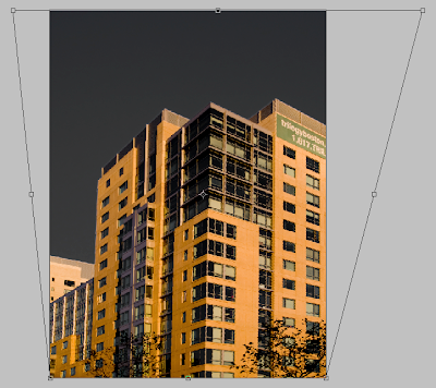
To the left is the layers palette as it exists in my Photoshop document. The names on the layers give an overall indication of the work done to the image. However, much of the actual darkening occurred before the image got to Photoshop. I did some initial corrections in Adobe Camera Raw. In particular, I pushed the blacks level to 55 and reduced the exposure just a bit. This helped darken the areas below the roof top. I converted to black & white which helped further develop the blacks.

The wide angle lens created a bit of distortion in the far buildings so I used the transformation tools to straighten them. I also did some painting in the lower right corner to remove the last remnants of the parking garage and other non-essential items. The final items were just to tweak the result. I added some film grain, cloned out some remaining non-essential items and added a slight vignette.


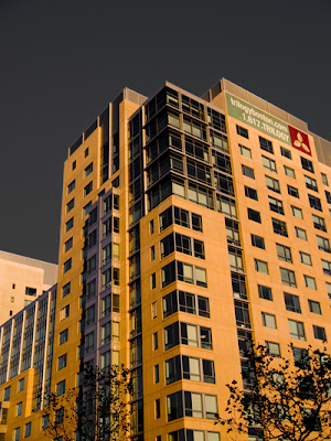
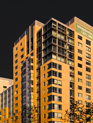
The image below is a variant of the final image. I wanted to see what the image would look like if I left it in color. This is not a selective color image. This is a full color image. It gives the appearance of a selective color image primarily because the buildings at the top are mostly gray and they are gray whether they are in the color image or a black and white image. This version of the image didn't get the full treatment that I gave the black and white. The buildings at the top aren't straight and there are some other things I would correct before I would consider this image done. I put it here to show an alternative interpretation.


All images Copyright © 2007 James W. Howe, all rights reserved.


This image and others are available for sale at my Online Gallery

Friday, July 18, 2008

Flying

Flying

This is a shot of a hood ornament from a 1933 Cadillac V16 452C. The car was one of many classic cars on display at the Eyes on Design car show held at the Edsel & Eleanor Ford Mansion in Grosse Pointe Shores, Michigan. I'm really pleased with how this image came out. The figure itself is sharp and shows the artistry and detail that was put into these things. The lighting is reasonable, and I think the background is nice as well. I converted this image to black & white and then used a curves adjustement layer to give just a bit of 'platinum' tone (see curve, below).


Shooting hood ornaments (or mascots) is not the easiest thing to do, particularly when you are trying to take these shots in the wild, rather than under the controlled conditions of a studio. Lighting is always tricky and controlling reflections is probably one of the biggest challenges. Another difficult element is backgrounds. If I had an assistant I could have had them hold up some board or cloth to create a background, but that wasn't an option. Instead, what I try to do is use a shallow depth of field and then try and find an angle on the object which puts an interesting background into the frame


One difficulty with using a shallow depth of field is that you really would like to get most of the figure in sharp focus, but you want the background to be quite blurry. In this case, I used my 70-300 lens (140-600mm 35mm equivalent focal length) at a wide aperature to ensure the out of focus background. Taking the shot from the side meant that I could get most of the figure in focus. If I had taken it more head on, I would either have had to close down my lens to get more DOF, or I would only have the front part of the figure in focus. Of course, the more DOF in the image, the less blurry the background.


At this car show, like most, the cars were parked next to each other, and fairly close, but not too close. I thought the hood ornament on this car went well against the background of the hood of another vintage vehicle. While I didn't notice it at the time, I like the brighter out of focus circles created from the car in the background and the way they line up with the head and wings of the figure. I also lucked out on the lighting. The sky was bright but overcast, so it created what amounted to a giant softbox. No real hotspots to contend with.


The image itself didn't require much post processing work. The usual curves to increase contrast a bit and the conversion to a toned black & white was about all the work that went into this image.


This image is for sale in my Hood Ornaments gallery at ImageKind. Please check it out.


Comments, questions and constructive criticism are welcome.


Copyright © 2008 James W. Howe - All Rights Reserved

Saturday, July 12, 2008

Verticality

Verticality

This is a shot of the Palmer Commons and the power plant at the University of Michigan in Ann Arbor. I was out one Sunday morning walking around campus looking for interesting things to take pictures of. This particular area is just outside of the central campus area as you head up towards the dormatories and the medical center area. The thing that really caught my eye, and the thing that made me want to take a picture, was all the vertical lines from this vantage point.


Starting from the right side of the image you see the tall smoke stack from the power plant. In the same area, a little lower there are the posts for the street signs. There are the lines in the pavement marking the cross walk. On the roof of the power plant there are short colored pipes sticking up. The windows of the building (Palmer Commons) create more vertical lines and when you get to the left side, there are the light poles. However, it took a bit of post-processing to get the image back to the way that I saw it when I was there.


The image above is the 'as shot' version of the finished image. As you can see, many of the vertical lines bend inward. I took this shot with a wide angle lens which introduced some distortion into the image. If I would have had a tripod with a nodal point bracket, I probably could have taken a panorama of the same scene and ended up with less distortion, but I didn't have that option. The other thing to notice about the unprocessed image is that the colors are relatively flat. This also wasn't quite what my mind saw when I was there.


When I initially worked on processing the shot I focused on the color. I did some work with curves and hue/saturation to bring more color and contrast to the image. The curves also gave me a more intense sky. After working on the image for awhile I sort of gave up. I thought it looked ok, but not great. Recently, I was going through some older shots when I saw my original take on this image. I really liked the look of the color, but I didn't like the distortion. Since I last worked on this image, I've picked up a few more Photoshop tips and I decided to give them a try. In particular, I wanted to use the Transformation tools to see if I could correct for most of the distortion.


Like my previous blog entry, High Rise - High Key, my main tools were the Transform -> Distort and Transform - Scale. I started with the Distort which allowed me to straighten the smoke stack on the right and the light poles on the left. Making this change, however, caused the image to shrink from the top. I then used scale to bring the elements back up to where they should be. Once I corrected for distortion, I then proceeded to work on the color.


The color work consisted primarily of converting the image to LAB and strengthening the A and B channels. Once I had the basic look, I converted back to RGB and did some tweaking of the curves to increase contrast just a bit more. I was trying to get something just a little bit unreal in the sky. The clouds that morning were quite interesting and I wanted to accentuate the sky just a bit more.


Overall I'm pleased with how the image came out. There is probably more noise in the sky than I would like but I haven't gone back to see what I could do about it. There are some other minor things that I would like to improve as well, but on the whole I think it looks pretty nice


This image was taken with an Olympus E-500 DSLR with the 14-54mm lens. The image was shot at 14mm (ff eq 28mm) with an aperture setting of f/11 and an ISO of 100.


Comments and constructive criticisms welcome


Copyright © 2007 James W. Howe - All Rights Reserved

Saturday, July 5, 2008

High Rise - High Key


I've been making a pass through some images that I have shot in the past looking for ones that I may have overlooked, or images that might give me a chance to experiment with. The image above is the result of one such experiment. The structure in this shot is the Trilogy Apartments in Boston, Massachusetts. The building is located about a block or two from Fenway Park. I was in Boston on vacation and had been wandering around taking pictures. It was late in the day and the sun was setting. This created some nice warm colors and a deep blue sky. I found the structure of the apartment building to be very interesting. I've always been attracted to buildings with strong geometric qualities so I took a few shots of the building from various angles. When I originally was looking over the images from the trip, I passed on the ones I had taken of the apartment building. I liked the underlying image, but it just didn't click with me.


As I was reviewing my images I once again took a look at the one you see to the left. I liked the color and shape, but it didn't really convey the geometric nature that had attracted me to the building in the first place.

My first thought was to produce a color image with the sky darkened. The windows in the color image were all dark and I thought the image might look nice if I replaced the blue sky with a black sky and left everything else alone.

In an effort to move the image in that direction, I bumped the blacks a bit in Camera Raw and then remove the saturation of the blues in the image and reduced the luminosity as well. This didn't completely blacken the sky, but it gave me a good start. My original plan was to go into Photoshop and use a curve and some masking to turn the sky black and then work on the rest of the building.


Before I did any more work on color/contrast I decided that I didn't like the way the building was tilting away from the camera. I didn't have the luxury of using a perspective correcting lens so I had to resort to some Photoshop post-processing to clean things up a bit. The first thing I did was create an editable layer which would let me do some transformations. I selected Transform->Skew and moved the upper left and right corners out until the sides of the building were parallel with the side of the image frame. The image below shows where I placed the corners.


Adjusting the skew caused the building to become quite short so my next task was to stretch the building back to something which resembled its original stature. For this I used the scale tool and simply scaled the building up until it looked right. After this, the image still had some perspective issues so I tweaked it a bit more using the warp tool. I also used the Lens Correction filter to remove a bit of barrel distortion as well.


At this point I had the image pretty much where I wanted it so I added a curves layer to darken the sky.


I liked the color version of the image seen above, but I decided to see how it would look as a black and white. I added a Black & White adjustment layer and pushed the building toward white while still keeping some detail and tonality.


I then added a curve to see if I could pull out just a bit more contrast while still keeping some tonality. As I adjusted the curve, I just kept increasing the contrast and the more extreme it got, the more I liked it. I finally used a curve which is almost vertical. The end result is what you see at the top, a pure black and white which really highlights the geometry of the building.


Technical Details


This shot was taken with an Olympus E-500 camera. The lens was the 14-54mm zoom lens zoomed to 23mm. Since the Olympus is a 4/3 camera, 23mm translates to a 35mm effective focal length of 46mm. Aperture was f/2.8 at ISO 100. The image capture was RAW and processed using Adobe Camera Raw and Photoshop CS3.


Comments and constructive criticisms welcome.


This image (and others) are for sale in my Black and White gallery at ImageKind. Please have a look around.


Thanks!


All images and text Copyright © 2008 James W. Howe - All Rights Reserved.