Saturday, November 8, 2008

Red Ferrari


(Olympus E-3, 14-54mm at 35mm (2x crop factor), ISO 100, exposure 1/100 sec @ f/8.0)

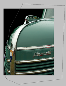
This shot of a new Ferrari automobile (sorry, I don't know the model for this one) was taken at the 2008 Concours d'Elegance held at Meadowbrook Hall in Rochester Hills, Michigan. This car was in a special section of the show reserved for new, high performance vehicles. This particular part of the exhibit included a couple different Ferraris, two different Saleen models as well as some other high end cars. When I originally went through the shots I took at the show, I passed this one by. It just didn't grab me. However, I was passing through my images at a later date and I decided to see if there were things which would improve the image.


(as shot)


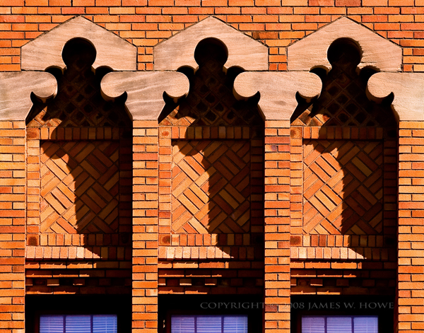
The image above shows the image as it came from the camera, before any processing at all. I liked the composition, but the color of the car was a bit off, the lighting was too bright (It was taken on a bright, sunny day) and there were other aspects of the shot which weren't great.

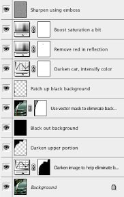
I had imported the image into Lightroom 2.0 and most of the processing of this image occurred there. To the left, you can see the history panel from Lightroom which shows the adjustments that were made.

I started with some exposure correction to make the image less bright and then pumped up the blacks to give it a little more contrast. I then adjusted the color a bit to make the red a little stronger. It may not be exactly what the car looked like, but my feeling of the car was that it was red so that was what I wanted to see in the image.

The next section involved adding some post-crop vignetting. For me the vignetting was change which made the biggest improvement. The addition of the vignette made the car look like it was under a spotlight. It also highlighted two distinctive elements of a Ferrari, the badge and the stallion.


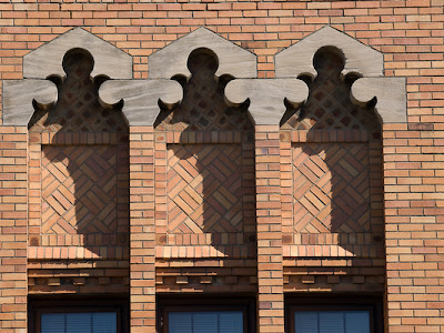
The image to the right shows the state of the image after making the Lightroom adjustments. It was definitely better, but there were a couple aspects of the image that I still didn't like.

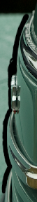
First, I didn't like the red color which was reflected in the stallion. The other was the fact that the background color of the badge was so faded. I think the angle of the sun just really washed out the yellow which should have been there.

I opened the image in Photoshop to make some local adjustments. It's possible that I could have done the same thing with the adjustment brush in Lightroom, but I'm not adept enough at that tool as of yet.


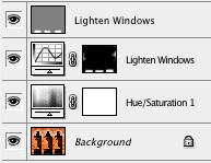
Here is a the Layers palette from Photoshop CS3 for the final image. The major items are an adjustment layer to remove the redo from the stallion, another layer to correct the badge, a sharpening layer and a couple additional clean-up layers.


The images above show a closeup of the stallion before I made my change and after. The change was pretty simple. I used a saturation adjustment layer and selected the reds. I then set the saturation to 0 to eliminate the red. Of course, the car was red so that pretty much took the color out of the car. I fixed that by creating a layer mask which masked out all of the car but left the grille alone.


The next thing to change was the Ferrari badge. The background should be yellow and in the raw image the color just wasn't right. I took another image which had a Ferrari badge in it and i sampled the yellow color. I then simply created a new layer on which to paint. I used a brush with the color set to Ferrari yellow and painted over the badge. I painted relatively carefully but I wanted to make sure the yellow was everywhere I needed it to be. I then cleaned things up by zooming in and painting on a mask to remove the yellow from places where it shouldn't have been.


(layer mask)


After I sharpened the image, I noticed that there were several flecks on the paint which were probably left after the car was washed. I created a layer and used the spot healing brush to remove them. Tedious, but simple. The other thing I did was to remove some reflections in the hood which looked more like paint flaws. I created another layer just for this and again used the spot healing brush to remove the unsightly reflections. The images below show a closeup of the hood before and after the spot healing operation


I'm happy with the way the image came out. I think the badge color now looks realistic and the vignetting makes the car look like it was lit from some lighting source rather than looking like a car that is just sitting out in the sun.


This image is for sale in my automobile details gallery.


Comments and feedback welcome.


Images and text Copyright © 2008 James W. Howe - All rights reserved

Sunday, November 2, 2008

New Photo Blog

I've started a new image blog at images.jameshowephotography.com. My plan is to post a new image to that blog several times a week (hopefully daily). This blog will continue as well at about the same rate as in the past (a few times a month). I would appreciate it if you would take the time to check out my new blog and leave me feedback.


Thanks!

Sunday, October 26, 2008

Experimentation


(Olympus E-3, 14-54mm lens at 20mm (2x crop factor), ISO 400, exposure 1/15 sec @ f/8)

Sometimes when I find myself in a creative rut I revisit previous images that I have taken to see if there is something new that I can do with them from a post-processing standpoint. The image above is one such example. The image came from a photography I made of a 1937 Cord 812 Beverly Sedan. The car was on display at the Gilmore Car Museum. Shooting in a museum is always tricky. You have lighting in the buildings which creates hot spots on the car, sometimes the lighting is dark, or other problems exist. For this image, the lights created hot spots on the car, there was a window just behind the car, and the overall lighting was sort of dark. I really like Cord automobiles, but I have never had a finished shot that I really liked. I'll sometimes get good compositions, but other aspects of the image don't work for me. In the case of the image above, I liked the composition, but I didn't like the way the lighting worked, so I didn't put any more time working on the image.


The image above is the 'as shot' image of the Cord. If you look to the left, you can see a window in the image, on the right there is light from another window reflecting off of the floor. In addition, there are little hot spot lights reflecting off of the car itself. As a 'regular' image, I just don't think this image works. However, I still liked the look of the shot. I think I like Cord's because they have a very angular design. They have interesting lines and details. If I could find some way to emphasize those features, I figured I might have a good image. Turns out that Photoshop had a filter which worked perfectly, I just didn't realize it existed!


Even though I use Photoshop on a regular basis, I tend to focus more on it's digital darkroom tools such as curves, levels, etc. I don't often venture into the more artistic filters. In general, I prefer to create photographs rather than photographic or digital art. However, it doesn't hurt to experiment. The other day, I was playing around with a new noise reduction tool. I found that when I used some extreme values I got an interesting result. Based on that experimentation, I decided to try some of the standard Photoshop filters. I ran across one that I had never used before called Cutout.


Cutout is interesting because it lets you create images which sort of look like maybe they were printed using wood block technology. You can dramatically limit the number of colors in the image, and you can play with how the edges in the image are rendered. Using different values you can get a complete abstract image if you want, or you can get something more like Andy Warhol. I found that by using this filter on images with some complex edges and colors, you could get some really cool results. I used this filter with varying settings on a variety of images. On some the effect was pretty useless, but on some of my detail shots, particular of mechanical items, the results were very pleasing.


On the image above, I used Cutout to create a highly posterized version of the image. I liked the way the color gradients came out. Because of the simplification of the color, I was able to go in and paint over the more annoying light spots. I also took out the side window as well. I could never have done this with the regular image using the clone tool because the colors were just too complex and the result would have look horrible. Some expert cloners might have been able to do things, but not me.


After getting the basic image where I wanted it, I increased the saturation a bit and added some additional contrast. I didn't need to do any sharpening, because the filter altered the image enough that sharpening would have been pointless. I simply saved the image with the end result that you see at the start of this posting.


Comments welcome.


Text and images Copyright © 2008 James W. Howe

Monday, October 20, 2008

State Theatre Marquee


This is a close-up shot of the marquee of the State Theatre in Ann Arbor, Michigan. This theatre was designed by C. Howard Crane and built in 1942. Crane also designed the ornate Fox Theater in Detroit. Most of the exterior of the theater is still intact, but inside the theater was cut up to create 4 theaters over two floors. Later the bottom two theaters were removed and converted to retail space.

I've always been attracted to the signage of this building. It has great Art Deco elements and I like the vivid colors. Even though the sign has seen some wear, it is still quite impressive. I was going through some shots I had taken of the theater and I was playing around with the zoom tool in Lightroom. I had zoomed in really close in one image and I really liked the extreme close up. It gave the image a bit more of an abstract feeling to it. I decided I needed to go back and use my 70-300mm lens (2x crop factor) and take some close up shots. I've posted a series of them on my Flickr account. I choose this one to post here because I liked the variety of elements in the shot. I like the color and shape of the sign, combined with the pattern of the brick and the shadow line along the right side.


The finished image has had some work to get it to where it is. The image above is the raw image as it came out of the camera. The shot was taken mid-afternoon and the sun was shining directly on the sign. This had the effect of creating some nice shadows, but it also washed the color out. I really wanted to emphasize both the color of the sign, but also the age of the sign as well. In order to do that I worked to improve the contrast, and pump up the colors. Most of the work was done in Lightroom 2.0. I used the blacks slider to add a bit of contrast. I used the vibrance slider to bring out some additional color in the brick and I used the individual saturation and luminosity sliders to bump up particular colors in the sign.

When I was mostly finished in Lightroom, I took the image over to Photoshop CS3. I noticed that the color of the wall seemed to have a bit of a greenish cast, so I used the color balance tool to make it a little redder and browner. The original shot also had more dark wall to the right which I felt distracted from the main element. I liked the shadow cast by the bricks so I kept that, but I trimmed away most of the dark area of the image. The other thing I did was to skew things a bit to straighten things out. I had to shoot this from down below and I didn't have the benefit of a tilt/shift lens, so I used the free transform tool in CS3 to move things around a bit. I finished up with some sharpening and a little vignette.

Image Details


The image was taken with an Olympus E-3 camera. The lens was the Zuiko 70-300 which gives a 35mm effective focal length of 140-600. The shot was taken with the lens zoomed to 92mm (184mm). Exposure was 1/250 @ f/13 at ISO 100.


Please feel free to leave comments or feedback. I would also appreciate it if you would visit my gallery at www.jameshowephotography.com. If you have any feedback about the gallery itself, please leave those comments here.

Text and images are Copyright © 2008 James W. Howe - All rights reserved

Sunday, September 28, 2008

Pierce Arrow Interior


This is an interior shot of 1920 Pierce Arrow automobile. The car was part of the Pierce Arrow Club's annual car show held at the Gilmore Car Museum near Battle Creek, Michigan. What I find interesting about this shot is the look of the gauges, particularly the speedometer. Instead of using some sort of sweep hand, it rolls up like an odometer (and tops out at 75).


This image has actually had very little processing done to it. The shot was originally in a 4/3 aspect ratio but as I looked at the image I decided that I would prefer a square crop. I wanted the emphasis of the shot to be on the gauges and the full shot had some stuff below the steering wheel which dragged my eye down and out of the image. The main processing for the shot was done in Lightroom 2 with a tiny bit of post processing in Photoshop. Other than the crop, the main thing I did in Lightroom was to add a 'post crop' vignette of -21 with a feather of 62. The vignette tool gives a nice darkening around the edge which helps draw the eye into the image and the feather helps to smooth out the vignette so you don't really notice it that much. I didn't want the vignette to be a distraction on it's own.


This shot was taken with my Olympus E-3 and the Olympus Zuiko 70-300 lens. Exposure was 1/125 @ f/6.3 and I was zoomed to 96mm (2x crop factor)


Image and text Copyright © 2008 James W. Howe - All rights reserved.


This image (and others) are available for purchase at my ImageKind gallery. Also, please check out my new website at www.jameshowephotography.com. Right now the site has a single gallery of some of my favorite images, but I hope to be adding more galleries in the future.


Thanks for looking in and please feel free to leave any comments you might have.

Tuesday, September 9, 2008

'39 Plymouth


This image is of a 1939 Plymouth Deluxe Convertible Sedan taken at the 2007 Concours d'Elegance at Medowbrook Hall in Rochester Hills, Michigan. I was digging through some old photos, keywording, flagging and such, and I came across the shot from which this image was created. I had passed this image by several times, thinking that it was just too plain. The color of the car was sort of flat and there was a bit of background in the image which made the shot look more like a snapshot than a composed image. This time when I was looking at it, I realized that with just a bit of work I could eliminate the background and probably improve the overall look of the image, so I decided to give it a try.


As Shot

To the left you can see the image as it came out of the camera. The details on the car itself are relatively flat, the color is mostly unexciting. The upper part of the background isn't too bad since it is darker and provides some contrast with the car itself, but the lower part of the background is too close in color to the car and there is very little separation between the car and background. Green cars on grass tend to have this sort of problem. My processing goals were fairly simple, blacken the background (to create contrast and remove distractions) and improve the color and contrast of the car itself.


Step 1

The first thing I did after bringing the image into Photoshop CS3 was to apply a curves adjustment layer. I used this layer to darken the entire image. This made the dark part of the background even darker (or completely black) and it helped create a little contrast between the car the the grassy area at the bottom of the image. At this point I wasn't interested in working on the car itself, so I created a layer mask to cover the car, leaving the adjustment layer to affect just the background area.


Step 2

In this step, I used the brush tool to paint the dark area of the background black. Much of the upper left portion of the image was already black, so I just had to paint over the areas which weren't. I used a soft brush and zoomed way in to the areas I wanted to paint and carefully painted with the black brush.


Step 3

In Step 3, I used the pen tool to create a vector mask of the car. I placed points along the curved parts of the engine area in the lower right of the image and then quickly added additional points to capture the entire car. I then went back and zoomed in on my points and adjusted them so that the curves matched the curves of the car. Once I was satisfied, I selected Layer->Vector Mask->Create from path... to create a vector mask. I then created a blank layer below my current layer and filled it with black. The background was now black, but it still needed some tweaking.


Step 4

When I zoomed into the background, I noticed that the line between the car and the black background was too sharp. In the original image, the background was fairly light so making it black with the sharp edge of the pen tool made the background look too fake. There are probably other ways to correct this, but my solution was to take a soft-edge brush at a lower opacity, and gently follow the curves of the car to soften the edge between the car and the background. I was using a Wacom tablet so this was a little easier than if I had been using a mouse. The image to the left shows the areas that I painted.


Layers Palette

Once I had the background complete, I turned my attention to the car itself. My first step was to use another curves adjustment layer to increase contrast in the car, and darken it. I used Normal blending mode instead of Luminosity because I wanted the bump in saturation. I liked the deeper green created from the adjustment layer.

I then noticed there was some red reflecting in the chrome so I added a Hue/Saturation layer and eliminated the red. Of course, there is a bit of red in the hood ornament, so I used a layer mask to recover the red in that spot. I gave the image just a bit more saturation, which helped bring up the color in the badge on the front of the car.

Finally, I used the Emboss filter to sharpen the image. I used a level of 4, desaturated the color, used Hard Light as the blending mode and reduced the opacity just a bit.


Overall I'm pleased with how this image came out.


This shot was taken with an Olympus E-500 with the Zuiko 14-54mm lens zoomed to 35mm (70mm if you use the 2x cropping factor). Exposure was 1/250 at f/4.0 using ISO 200.


Comments and constructive criticisms are always welcome.


This image and others are for sale at my Automobile Details gallery on ImageKind. Please check it out.


Image Copyright © 2007 James W. Howe - All rights reserved

Tuesday, September 2, 2008

Scream


This shot was taken during Scott Kelby's Worldwide Photowalk in Detroit, Michigan. I don't normally take pictures of kids simply because people might get the wrong impression, however during the photowalk there were several of us taking pictures of kids in the fountain so it was less of a problem. This particular fountain is located along the Detroit Riverwalk, just behind the Renaissance Center (GM Headquarters). The day of our photowalk was quite warm and there were several kids playing in this fountain. This particular boy was running through the fountain yelling at the spouts of water as they shot up. As he was running through the fountain I took several shots and this one was the best of the bunch. I like the way the water is just coming up from the fountain as if his yelling was causing the water to shoot up.


The image to the left is the 'as shot' image. When I was working on the image I wanted to eliminate extra elements from the shot and focus on the boy and his relationship with the fountain. While I did some original work to adjust the color, I decided fairly quickly on that a black and white image would look the best. All processing was done using Lightroom 2.0, with minor finishing work in Photoshop CS3.


This shot was taken using an Olympus E-3 with the 70-300 Digital Zuiko lens. Focal length was 190mm with a crop factor of 2x. Exposure was 1/640 @ f/5.6 using ISO 100.


Comments and suggestions are welcome.


Image and text Copyright © 2008 James W. Howe - All rights reserved

Friday, August 29, 2008

Thanks!

Recently I had the pleasure of attending the Detroit edition of Scott Kelby's Worldwide Photowalk. Scott has written a new book on Lightroom 2.0 and as a way of celebrating its release he decided to arrange for 'photowalks' in numerous cities. Each photowalk was limited to 50 people, but some cities had more than one photowalk. The idea was so popular that there were photowalks in more than 237 cities world wide. As part of the event prizes were given out. The leader in each city picked a winner from their photowalk. That winner won a copy of Scott's new Lightroom 2.0 book. Each of these winners was then in the running for a grand prize. In addition to the grand prize, there were also 10 runners up who won a prize as well. Well, Scott announced the winners today on his blog and I'm honored to be one of the 10 runners up with my Renaissance Center image.


Given the high quality of the images that were submitted for the photowalk (search Flickr tags for 'scottkelbyphotowalk', or just search for "Scott Kelby's Worldwide Photowalk") it is quite an honor to be selected not only as best for the Detroit photowalk, but to be one of the 10 runners up. I'd like to thank Scott for having this event, and to Terry White for running the Detroit photowalk. I had a great time wandering around the Detroit riverfront area taking pictures with a bunch of other photographers. I hope this becomes an annual affair (prize or no prize.)


Thanks!

Sunday, August 24, 2008

Renaissance Center

Renaissance Center

This is a picture of the Renaissance Center located along the river front in downtown Detroit, Michigan. The building was built in the 70's with funding by Ford Motor Company and in an interesting twist, the building is now the world headquarters for General Motors. The building was designed by the same firm that designed Peachtree Center in Atlanta, Georgia and a similar facility in downtown Los Angeles (the name escapes me). This shot was taken during the the Detroit edition of Scott Kelby's Worldwide Photowalk. The photowalk was meant to celebrate the publishing of Scott Kelby's latest book on Lightroom 2.0. Up to 50 photographers in over 200 cities world wide participated in the photowalk.


This is the shot as it came out of the camera. There is a slight tilt to the shot and the color is a bit flat. I used the tools in Lightroom 2.0 to straighten the image and also adjust the exposure and perform the conversion to black and white. One of the things that I wanted to bring out in the image was the character in the sky. When I took the shot I was already thinking that it would look good in black and white. I knew the blue sky could be darkened a bit to create some more drama. However, as I was working on the image I debated about just keeping it in color, but as you can see, I ultimately decided to go with black and white.


These are the settings I used in Lightroom to get the exposure where I wanted it. I left the exposure slider about the same, but I used recovery to bring out a bit more in the sky, and I used the black and fill light to add a bit more contrast to the building without losing detail.


The conversion to black and white was done using the Grayscale palette. I wanted to darken the sky so I reduced the blue, and then I used the color selector tool to selectively brighten or darken parts of the image. I finished things off using the split tone functionality.


Some additional changes were made in Lightroom including adding a bit of clarity and some sharpening. I finished the image off in Photoshop, mostly to do some final sharpening and to add a border to the image.


The image was taken with an Olympus E-3 using the 14-54mm lens at 14mm (28mm full frame equivalent). Exposure was 1/400 at f/8.0 using ISO 100.


Comments and constructive criticisms welcome.


Image available for purchase at my ImageKind gallery.


Thanks for looking in!


Images and text Copyright © 2008 James W. Howe - All rights reserved

Tuesday, August 19, 2008

809 Kingsley


This image is of a local apartment building located near the University of Michigan medical campus. This part of town has many rental units, but most are either converted houses or more mundane apartment buildings. This building was built in 1929 and is a great example of the Mediterranean Revival architectural style. I took the shot mid-morning when the sun was shining on it at a nice angle and I really liked the strong shadows created by the unique architectural elements. I wasn't able to get the shot of the building straight on, there were people working on a house across the street which prevented me from getting a good angle. I ended up taking the picture from a slight angle and then relied on Photoshop to help with some perspective correction.


The image above is the 'as shot' version of the image. As you can see, the image has a bit of perspective distortion because was forced to take the picture from a slight angle. The image also tilts back a bit since I had to shot at a slight upward angle. When I took the shot I figured I would have to do some perspective correction, so I made sure that I framed it a little wide so I would have extra pixels to deal with.


The layers palette above only shows part of the story of the processing. I started in Lightroom and made adjustments to bring out the color in the brick. The shot was taken in bright sunshine, and the raw image sort of washed out the vibrant color that I remember seeing when I took the picture. In Lightroom I increased the black level a bit and increased some of the contrast. I adjusted the exposure and recovery a bit to bring out the color in the brick.

The remainder of the processing involved performing some perspective correction and some curves work to bring out the color of the windows in the lower part of the image. When I took the shot, I noticed the blue sky reflecting in the windows and I thought it made an interesting color combination with the orange/red brick. As I processed the image, the window color sort of got lost, so I added a curves layer to focus on just the windows. I finished off with a dodge/burn layer to brighten the windows up just a bit more.


This image was taken with an Olympus E-3 DSLR using a 70-300mm Zuiko lens. This lens has a 35mm FOV equivalent of 140-600. The lens was zoomed to 141 or the equivalent of 282mm on a 35mm camera. Exposure was 1/400 at f5.6.


Comments and constructive criticism/suggestions are welcome. This image available for purchase at my Color gallery at ImageKind.


Image and text Copyright © 2008 James W. Howe - All rights reserved

Thursday, August 7, 2008

Duesenbird


This is shot of the hood ornament (mascot) of a 1935 Duesenberg Model JN. This particular Duesenberg was a gift to Clark Gable from his wife, Carole Lombard. The Duesenberg was one of many fine automobiles on display at the 2008 Concours d'Elegance held at Meadowbrook Hall in Rochester Hills, Michigan. The background of this shot is actually a 1934 LaSalle owned by auto executive Robert Lutz.

Shooting cars in the 'wild' is always a challenge. You have to deal with crowds, weather, distracting reflections, etc. An ideal day for shooting would be overcast where the light is even. Unfortunately the day of the event the weather was too nice, blue skies and no clouds. When I took this shot, the car was under some trees so the lighting was a bit more diffuse, but there were still plenty of reflections to deal with. As you can see in the 'as shot' image below, there was quite a bit of green reflecting in the chrome. The nice thing is that the curve of the chrome helped make the reflections a bit more abstract. You can make out the sky and trees, but you don't see a lot of people or defined shapes.


My first attempt at processing involved simply using Lightroom 2 to do all the adjustments. I increased the blacks a bit, increased contrast and got an image that was quite nice. However, the more I looked at the image the more I thought that a black & white conversion would produce a better image. For one thing, it would make the images in the reflection a bit more abstract. I also thought it would focus the eye more on the details themselves rather than the color.


To the left you see the layers palette for the black & white conversion. There wasn't much processing needed. I started with a basic black & white adjustment layer. I lightened the background a bit and darkened some of the grillework. After the basic conversion, I added a curves adjustment layer to increase the contrast. I also wanted to bring out the Duesenberg badge so I added another curves layer which dramatically lightened the image. I used a layer mask to mask out all but the badge. I finished things up by using the Emboss filter in Overlay mode to sharpen the image.


This image is available for purchase in my Black & White gallery at ImageKind.

Tuesday, July 22, 2008

Monona Terrace


This is a shot taken from the top of Monona Terrace in Madison, Wisconsin. Monona Terrace was designed by Frank Lloyd Wright but never built in his lifetime. Several years ago the project was resurrected and built. The building itself is hard to photograph unless you are out in a boat on the lake. The rooftop has a great terrace which has wonderful views of Lake Monona to the southeast, and the capitol building to the north west. The terrace also has a walkway which leads directly out to downtown Madison and it's a short walk to the capitol.


As you can see in 'as shot' image below, the original image was in color. I was trying to capture some of the lines and curves which make up the design of the building. I also liked the pattern in the pavement. My feeling is that while I may have captured some of the elements that I wanted, the raw image looks more like a snapshot than a finished work. There is visual competition from the parking lot/garage in the bottom right, people walking in the upper right and the buildings at the top. When I worked on this image, I wanted to reduce the clutter and make the image more about the lines and curves of Monona Terrace itself. I liked the buildings in the background, particularly since they are of a more 'traditional' design, but I wanted to de-emphasize them.


To the left is the layers palette as it exists in my Photoshop document. The names on the layers give an overall indication of the work done to the image. However, much of the actual darkening occurred before the image got to Photoshop. I did some initial corrections in Adobe Camera Raw. In particular, I pushed the blacks level to 55 and reduced the exposure just a bit. This helped darken the areas below the roof top. I converted to black & white which helped further develop the blacks.

The wide angle lens created a bit of distortion in the far buildings so I used the transformation tools to straighten them. I also did some painting in the lower right corner to remove the last remnants of the parking garage and other non-essential items. The final items were just to tweak the result. I added some film grain, cloned out some remaining non-essential items and added a slight vignette.


The image below is a variant of the final image. I wanted to see what the image would look like if I left it in color. This is not a selective color image. This is a full color image. It gives the appearance of a selective color image primarily because the buildings at the top are mostly gray and they are gray whether they are in the color image or a black and white image. This version of the image didn't get the full treatment that I gave the black and white. The buildings at the top aren't straight and there are some other things I would correct before I would consider this image done. I put it here to show an alternative interpretation.


All images Copyright © 2007 James W. Howe, all rights reserved.


This image and others are available for sale at my Online Gallery

Friday, July 18, 2008

Flying

Flying

This is a shot of a hood ornament from a 1933 Cadillac V16 452C. The car was one of many classic cars on display at the Eyes on Design car show held at the Edsel & Eleanor Ford Mansion in Grosse Pointe Shores, Michigan. I'm really pleased with how this image came out. The figure itself is sharp and shows the artistry and detail that was put into these things. The lighting is reasonable, and I think the background is nice as well. I converted this image to black & white and then used a curves adjustement layer to give just a bit of 'platinum' tone (see curve, below).


Shooting hood ornaments (or mascots) is not the easiest thing to do, particularly when you are trying to take these shots in the wild, rather than under the controlled conditions of a studio. Lighting is always tricky and controlling reflections is probably one of the biggest challenges. Another difficult element is backgrounds. If I had an assistant I could have had them hold up some board or cloth to create a background, but that wasn't an option. Instead, what I try to do is use a shallow depth of field and then try and find an angle on the object which puts an interesting background into the frame


One difficulty with using a shallow depth of field is that you really would like to get most of the figure in sharp focus, but you want the background to be quite blurry. In this case, I used my 70-300 lens (140-600mm 35mm equivalent focal length) at a wide aperature to ensure the out of focus background. Taking the shot from the side meant that I could get most of the figure in focus. If I had taken it more head on, I would either have had to close down my lens to get more DOF, or I would only have the front part of the figure in focus. Of course, the more DOF in the image, the less blurry the background.


At this car show, like most, the cars were parked next to each other, and fairly close, but not too close. I thought the hood ornament on this car went well against the background of the hood of another vintage vehicle. While I didn't notice it at the time, I like the brighter out of focus circles created from the car in the background and the way they line up with the head and wings of the figure. I also lucked out on the lighting. The sky was bright but overcast, so it created what amounted to a giant softbox. No real hotspots to contend with.


The image itself didn't require much post processing work. The usual curves to increase contrast a bit and the conversion to a toned black & white was about all the work that went into this image.


This image is for sale in my Hood Ornaments gallery at ImageKind. Please check it out.


Comments, questions and constructive criticism are welcome.


Copyright © 2008 James W. Howe - All Rights Reserved

Saturday, July 12, 2008

Verticality

Verticality

This is a shot of the Palmer Commons and the power plant at the University of Michigan in Ann Arbor. I was out one Sunday morning walking around campus looking for interesting things to take pictures of. This particular area is just outside of the central campus area as you head up towards the dormatories and the medical center area. The thing that really caught my eye, and the thing that made me want to take a picture, was all the vertical lines from this vantage point.


Starting from the right side of the image you see the tall smoke stack from the power plant. In the same area, a little lower there are the posts for the street signs. There are the lines in the pavement marking the cross walk. On the roof of the power plant there are short colored pipes sticking up. The windows of the building (Palmer Commons) create more vertical lines and when you get to the left side, there are the light poles. However, it took a bit of post-processing to get the image back to the way that I saw it when I was there.


The image above is the 'as shot' version of the finished image. As you can see, many of the vertical lines bend inward. I took this shot with a wide angle lens which introduced some distortion into the image. If I would have had a tripod with a nodal point bracket, I probably could have taken a panorama of the same scene and ended up with less distortion, but I didn't have that option. The other thing to notice about the unprocessed image is that the colors are relatively flat. This also wasn't quite what my mind saw when I was there.


When I initially worked on processing the shot I focused on the color. I did some work with curves and hue/saturation to bring more color and contrast to the image. The curves also gave me a more intense sky. After working on the image for awhile I sort of gave up. I thought it looked ok, but not great. Recently, I was going through some older shots when I saw my original take on this image. I really liked the look of the color, but I didn't like the distortion. Since I last worked on this image, I've picked up a few more Photoshop tips and I decided to give them a try. In particular, I wanted to use the Transformation tools to see if I could correct for most of the distortion.


Like my previous blog entry, High Rise - High Key, my main tools were the Transform -> Distort and Transform - Scale. I started with the Distort which allowed me to straighten the smoke stack on the right and the light poles on the left. Making this change, however, caused the image to shrink from the top. I then used scale to bring the elements back up to where they should be. Once I corrected for distortion, I then proceeded to work on the color.


The color work consisted primarily of converting the image to LAB and strengthening the A and B channels. Once I had the basic look, I converted back to RGB and did some tweaking of the curves to increase contrast just a bit more. I was trying to get something just a little bit unreal in the sky. The clouds that morning were quite interesting and I wanted to accentuate the sky just a bit more.


Overall I'm pleased with how the image came out. There is probably more noise in the sky than I would like but I haven't gone back to see what I could do about it. There are some other minor things that I would like to improve as well, but on the whole I think it looks pretty nice


This image was taken with an Olympus E-500 DSLR with the 14-54mm lens. The image was shot at 14mm (ff eq 28mm) with an aperture setting of f/11 and an ISO of 100.


Comments and constructive criticisms welcome


Copyright © 2007 James W. Howe - All Rights Reserved

Saturday, July 5, 2008

High Rise - High Key


I've been making a pass through some images that I have shot in the past looking for ones that I may have overlooked, or images that might give me a chance to experiment with. The image above is the result of one such experiment. The structure in this shot is the Trilogy Apartments in Boston, Massachusetts. The building is located about a block or two from Fenway Park. I was in Boston on vacation and had been wandering around taking pictures. It was late in the day and the sun was setting. This created some nice warm colors and a deep blue sky. I found the structure of the apartment building to be very interesting. I've always been attracted to buildings with strong geometric qualities so I took a few shots of the building from various angles. When I originally was looking over the images from the trip, I passed on the ones I had taken of the apartment building. I liked the underlying image, but it just didn't click with me.


As I was reviewing my images I once again took a look at the one you see to the left. I liked the color and shape, but it didn't really convey the geometric nature that had attracted me to the building in the first place.

My first thought was to produce a color image with the sky darkened. The windows in the color image were all dark and I thought the image might look nice if I replaced the blue sky with a black sky and left everything else alone.

In an effort to move the image in that direction, I bumped the blacks a bit in Camera Raw and then remove the saturation of the blues in the image and reduced the luminosity as well. This didn't completely blacken the sky, but it gave me a good start. My original plan was to go into Photoshop and use a curve and some masking to turn the sky black and then work on the rest of the building.


Before I did any more work on color/contrast I decided that I didn't like the way the building was tilting away from the camera. I didn't have the luxury of using a perspective correcting lens so I had to resort to some Photoshop post-processing to clean things up a bit. The first thing I did was create an editable layer which would let me do some transformations. I selected Transform->Skew and moved the upper left and right corners out until the sides of the building were parallel with the side of the image frame. The image below shows where I placed the corners.


Adjusting the skew caused the building to become quite short so my next task was to stretch the building back to something which resembled its original stature. For this I used the scale tool and simply scaled the building up until it looked right. After this, the image still had some perspective issues so I tweaked it a bit more using the warp tool. I also used the Lens Correction filter to remove a bit of barrel distortion as well.


At this point I had the image pretty much where I wanted it so I added a curves layer to darken the sky.


I liked the color version of the image seen above, but I decided to see how it would look as a black and white. I added a Black & White adjustment layer and pushed the building toward white while still keeping some detail and tonality.


I then added a curve to see if I could pull out just a bit more contrast while still keeping some tonality. As I adjusted the curve, I just kept increasing the contrast and the more extreme it got, the more I liked it. I finally used a curve which is almost vertical. The end result is what you see at the top, a pure black and white which really highlights the geometry of the building.


Technical Details


This shot was taken with an Olympus E-500 camera. The lens was the 14-54mm zoom lens zoomed to 23mm. Since the Olympus is a 4/3 camera, 23mm translates to a 35mm effective focal length of 46mm. Aperture was f/2.8 at ISO 100. The image capture was RAW and processed using Adobe Camera Raw and Photoshop CS3.


Comments and constructive criticisms welcome.


This image (and others) are for sale in my Black and White gallery at ImageKind. Please have a look around.


Thanks!


All images and text Copyright © 2008 James W. Howe - All Rights Reserved.