Showing posts with label car. Show all posts

Sunday, October 26, 2008

Experimentation


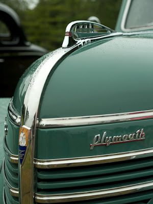
(Olympus E-3, 14-54mm lens at 20mm (2x crop factor), ISO 400, exposure 1/15 sec @ f/8)

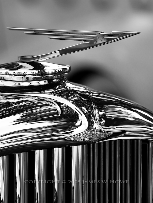
Sometimes when I find myself in a creative rut I revisit previous images that I have taken to see if there is something new that I can do with them from a post-processing standpoint. The image above is one such example. The image came from a photography I made of a 1937 Cord 812 Beverly Sedan. The car was on display at the Gilmore Car Museum. Shooting in a museum is always tricky. You have lighting in the buildings which creates hot spots on the car, sometimes the lighting is dark, or other problems exist. For this image, the lights created hot spots on the car, there was a window just behind the car, and the overall lighting was sort of dark. I really like Cord automobiles, but I have never had a finished shot that I really liked. I'll sometimes get good compositions, but other aspects of the image don't work for me. In the case of the image above, I liked the composition, but I didn't like the way the lighting worked, so I didn't put any more time working on the image.


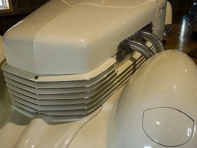
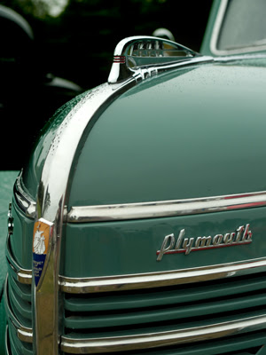
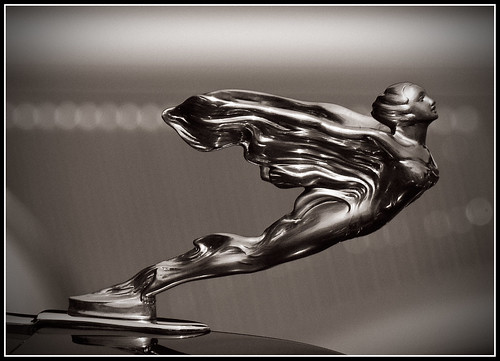
The image above is the 'as shot' image of the Cord. If you look to the left, you can see a window in the image, on the right there is light from another window reflecting off of the floor. In addition, there are little hot spot lights reflecting off of the car itself. As a 'regular' image, I just don't think this image works. However, I still liked the look of the shot. I think I like Cord's because they have a very angular design. They have interesting lines and details. If I could find some way to emphasize those features, I figured I might have a good image. Turns out that Photoshop had a filter which worked perfectly, I just didn't realize it existed!


Even though I use Photoshop on a regular basis, I tend to focus more on it's digital darkroom tools such as curves, levels, etc. I don't often venture into the more artistic filters. In general, I prefer to create photographs rather than photographic or digital art. However, it doesn't hurt to experiment. The other day, I was playing around with a new noise reduction tool. I found that when I used some extreme values I got an interesting result. Based on that experimentation, I decided to try some of the standard Photoshop filters. I ran across one that I had never used before called Cutout.


Cutout is interesting because it lets you create images which sort of look like maybe they were printed using wood block technology. You can dramatically limit the number of colors in the image, and you can play with how the edges in the image are rendered. Using different values you can get a complete abstract image if you want, or you can get something more like Andy Warhol. I found that by using this filter on images with some complex edges and colors, you could get some really cool results. I used this filter with varying settings on a variety of images. On some the effect was pretty useless, but on some of my detail shots, particular of mechanical items, the results were very pleasing.


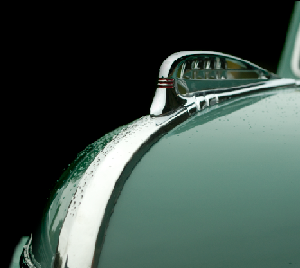
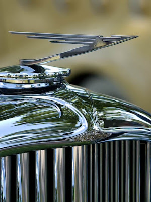
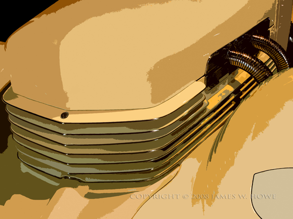
On the image above, I used Cutout to create a highly posterized version of the image. I liked the way the color gradients came out. Because of the simplification of the color, I was able to go in and paint over the more annoying light spots. I also took out the side window as well. I could never have done this with the regular image using the clone tool because the colors were just too complex and the result would have look horrible. Some expert cloners might have been able to do things, but not me.


After getting the basic image where I wanted it, I increased the saturation a bit and added some additional contrast. I didn't need to do any sharpening, because the filter altered the image enough that sharpening would have been pointless. I simply saved the image with the end result that you see at the start of this posting.


Comments welcome.


Text and images Copyright © 2008 James W. Howe

Tuesday, September 9, 2008

'39 Plymouth


This image is of a 1939 Plymouth Deluxe Convertible Sedan taken at the 2007 Concours d'Elegance at Medowbrook Hall in Rochester Hills, Michigan. I was digging through some old photos, keywording, flagging and such, and I came across the shot from which this image was created. I had passed this image by several times, thinking that it was just too plain. The color of the car was sort of flat and there was a bit of background in the image which made the shot look more like a snapshot than a composed image. This time when I was looking at it, I realized that with just a bit of work I could eliminate the background and probably improve the overall look of the image, so I decided to give it a try.


As Shot

To the left you can see the image as it came out of the camera. The details on the car itself are relatively flat, the color is mostly unexciting. The upper part of the background isn't too bad since it is darker and provides some contrast with the car itself, but the lower part of the background is too close in color to the car and there is very little separation between the car and background. Green cars on grass tend to have this sort of problem. My processing goals were fairly simple, blacken the background (to create contrast and remove distractions) and improve the color and contrast of the car itself.


Step 1

The first thing I did after bringing the image into Photoshop CS3 was to apply a curves adjustment layer. I used this layer to darken the entire image. This made the dark part of the background even darker (or completely black) and it helped create a little contrast between the car the the grassy area at the bottom of the image. At this point I wasn't interested in working on the car itself, so I created a layer mask to cover the car, leaving the adjustment layer to affect just the background area.


Step 2

In this step, I used the brush tool to paint the dark area of the background black. Much of the upper left portion of the image was already black, so I just had to paint over the areas which weren't. I used a soft brush and zoomed way in to the areas I wanted to paint and carefully painted with the black brush.


Step 3

In Step 3, I used the pen tool to create a vector mask of the car. I placed points along the curved parts of the engine area in the lower right of the image and then quickly added additional points to capture the entire car. I then went back and zoomed in on my points and adjusted them so that the curves matched the curves of the car. Once I was satisfied, I selected Layer->Vector Mask->Create from path... to create a vector mask. I then created a blank layer below my current layer and filled it with black. The background was now black, but it still needed some tweaking.


Step 4

When I zoomed into the background, I noticed that the line between the car and the black background was too sharp. In the original image, the background was fairly light so making it black with the sharp edge of the pen tool made the background look too fake. There are probably other ways to correct this, but my solution was to take a soft-edge brush at a lower opacity, and gently follow the curves of the car to soften the edge between the car and the background. I was using a Wacom tablet so this was a little easier than if I had been using a mouse. The image to the left shows the areas that I painted.


Layers Palette

Once I had the background complete, I turned my attention to the car itself. My first step was to use another curves adjustment layer to increase contrast in the car, and darken it. I used Normal blending mode instead of Luminosity because I wanted the bump in saturation. I liked the deeper green created from the adjustment layer.

I then noticed there was some red reflecting in the chrome so I added a Hue/Saturation layer and eliminated the red. Of course, there is a bit of red in the hood ornament, so I used a layer mask to recover the red in that spot. I gave the image just a bit more saturation, which helped bring up the color in the badge on the front of the car.

Finally, I used the Emboss filter to sharpen the image. I used a level of 4, desaturated the color, used Hard Light as the blending mode and reduced the opacity just a bit.


Overall I'm pleased with how this image came out.


This shot was taken with an Olympus E-500 with the Zuiko 14-54mm lens zoomed to 35mm (70mm if you use the 2x cropping factor). Exposure was 1/250 at f/4.0 using ISO 200.


Comments and constructive criticisms are always welcome.


This image and others are for sale at my Automobile Details gallery on ImageKind. Please check it out.


Image Copyright © 2007 James W. Howe - All rights reserved

Thursday, August 7, 2008

Duesenbird


This is shot of the hood ornament (mascot) of a 1935 Duesenberg Model JN. This particular Duesenberg was a gift to Clark Gable from his wife, Carole Lombard. The Duesenberg was one of many fine automobiles on display at the 2008 Concours d'Elegance held at Meadowbrook Hall in Rochester Hills, Michigan. The background of this shot is actually a 1934 LaSalle owned by auto executive Robert Lutz.

Shooting cars in the 'wild' is always a challenge. You have to deal with crowds, weather, distracting reflections, etc. An ideal day for shooting would be overcast where the light is even. Unfortunately the day of the event the weather was too nice, blue skies and no clouds. When I took this shot, the car was under some trees so the lighting was a bit more diffuse, but there were still plenty of reflections to deal with. As you can see in the 'as shot' image below, there was quite a bit of green reflecting in the chrome. The nice thing is that the curve of the chrome helped make the reflections a bit more abstract. You can make out the sky and trees, but you don't see a lot of people or defined shapes.


My first attempt at processing involved simply using Lightroom 2 to do all the adjustments. I increased the blacks a bit, increased contrast and got an image that was quite nice. However, the more I looked at the image the more I thought that a black & white conversion would produce a better image. For one thing, it would make the images in the reflection a bit more abstract. I also thought it would focus the eye more on the details themselves rather than the color.


To the left you see the layers palette for the black & white conversion. There wasn't much processing needed. I started with a basic black & white adjustment layer. I lightened the background a bit and darkened some of the grillework. After the basic conversion, I added a curves adjustment layer to increase the contrast. I also wanted to bring out the Duesenberg badge so I added another curves layer which dramatically lightened the image. I used a layer mask to mask out all but the badge. I finished things up by using the Emboss filter in Overlay mode to sharpen the image.


This image is available for purchase in my Black & White gallery at ImageKind.

Friday, July 18, 2008

Flying

Flying

This is a shot of a hood ornament from a 1933 Cadillac V16 452C. The car was one of many classic cars on display at the Eyes on Design car show held at the Edsel & Eleanor Ford Mansion in Grosse Pointe Shores, Michigan. I'm really pleased with how this image came out. The figure itself is sharp and shows the artistry and detail that was put into these things. The lighting is reasonable, and I think the background is nice as well. I converted this image to black & white and then used a curves adjustement layer to give just a bit of 'platinum' tone (see curve, below).


Shooting hood ornaments (or mascots) is not the easiest thing to do, particularly when you are trying to take these shots in the wild, rather than under the controlled conditions of a studio. Lighting is always tricky and controlling reflections is probably one of the biggest challenges. Another difficult element is backgrounds. If I had an assistant I could have had them hold up some board or cloth to create a background, but that wasn't an option. Instead, what I try to do is use a shallow depth of field and then try and find an angle on the object which puts an interesting background into the frame


One difficulty with using a shallow depth of field is that you really would like to get most of the figure in sharp focus, but you want the background to be quite blurry. In this case, I used my 70-300 lens (140-600mm 35mm equivalent focal length) at a wide aperature to ensure the out of focus background. Taking the shot from the side meant that I could get most of the figure in focus. If I had taken it more head on, I would either have had to close down my lens to get more DOF, or I would only have the front part of the figure in focus. Of course, the more DOF in the image, the less blurry the background.


At this car show, like most, the cars were parked next to each other, and fairly close, but not too close. I thought the hood ornament on this car went well against the background of the hood of another vintage vehicle. While I didn't notice it at the time, I like the brighter out of focus circles created from the car in the background and the way they line up with the head and wings of the figure. I also lucked out on the lighting. The sky was bright but overcast, so it created what amounted to a giant softbox. No real hotspots to contend with.


The image itself didn't require much post processing work. The usual curves to increase contrast a bit and the conversion to a toned black & white was about all the work that went into this image.


This image is for sale in my Hood Ornaments gallery at ImageKind. Please check it out.


Comments, questions and constructive criticism are welcome.


Copyright © 2008 James W. Howe - All Rights Reserved