Sunday, February 17, 2008

9542

9542

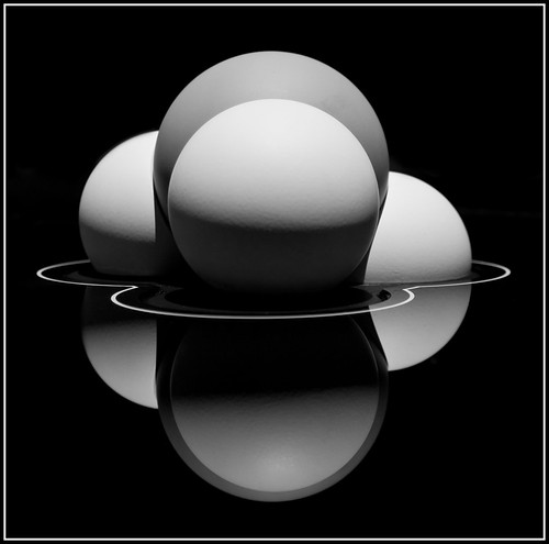
This is a shot of a westbound train taken in Durand, Michigan. Durand is a fairly busy crossroads for freight trains and they have a fairly nice historic train depot. I had seen some other shots from Durand on Flickr so I decided to make a day trip to check it out.

Shortly after I arrived, two trains arrived at the same time. One was coming down from the north and turned to head east, and the other was westbound. As the trains arrived at the intersection they were moving very slowly. In fact, the eastbound train was mostly stopped by the time the westbound train passed it. The shot was taken with an Olympus E-500 using a 40-150mm zoom lens (which has a 35mm equivalent range of 80-300) at 150mm to get a close-up shot of the trains without actually standing on the tracks. I took a series of images as the trains approached each other and I felt that this was the best of the bunch. The finished image you see above has had some work done on it to achieve the final image as I'll describe below.


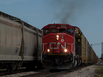
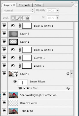
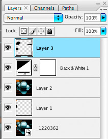
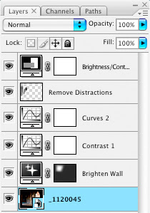
Above you see the image as it was shot along with the full layers palette from the Photoshop file. While the sky in the background is mostly blue, it was somewhat hazy and the light was reasonably flat. Still, as I started the work with the image I hadn't yet made the decision to go to black & white.


If you look at the layers palette you can see that the first thing I did after bringing the image in from Adobe Camera Raw was to remove some wires and tree branches. If you look at the original, you can see some wires over the train on the right side, and a few tree branches peeking out above the train on the left. I used the clone stamp tool to remove these items


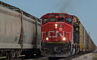
The image to the right is the result of cloning out the wires and branches as well as adding a shadow/highlight layer. The main effect of the shadow/highlight layer was to bring out some of the detail on the front of the train. It also lightened the train on the left a bit, particularly down by the wheels.


As I looked at the image I didn't like the fact that it didn't convey a sense of motion. The train to the left was mostly stopped at this time, but the one on the right was moving toward me, but slowly. At the time I probably should have panned with the one train to get some blur, but I was busy firing off shots as it came at me and I didn't think of it at the time. As a result, I decided to add a little blur to the left train in post processing.

I used my selection tool to select the train elements, cars, wheels, etc. while avoiding the track. I only wanted to blur the train, not the entire background. I copied this selection on to its own layer and applied a mild motion blur. My intent was not to give the impression that the trains were flying by each other, I just wanted to give the sense that they were moving. I used an angle of -18 degrees to match the angle of the train and used a distance of 64 pixels.


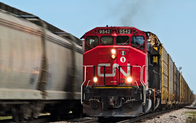
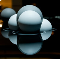
The next step in post processing was to adjust the levels to set the white and black points and then add a curves layer to add a bit more contrast to the image. The image to the right is now showing a bit more color and depth than the original image. At this point I decided to see what the image might look like as a black & white image.


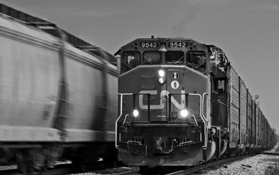
The first step in the black & white conversion was to simply add a black & white adjustment layer. I'm using Photoshop CS3 so this is a pretty easy step. While in the black & white dialog, I adjusted things so that the sky would appear darker. Everything else was pretty much balanced out: 35% reds, %60 yellows, 40% greens, -44% cyans, -200% blues and 80% magentas


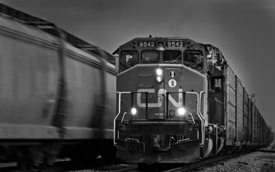
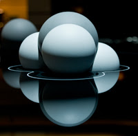
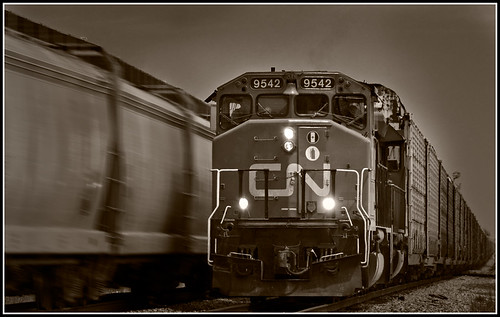
At this point I was fairly pleased with the black & white look but I wanted to draw more attention to the oncoming train. First i added a layer where I added a vignette. I used a technique I read in Scott Kelby's book The Adobe Photoshop CS2 Book for Digital Photographers which involves adding new layer from the Layers menu. When you create the layer, you specify Overlay as the blend mode and fill with 50% gray. I then took a rectangular selection tool and created large selection in the middle of the image. I then feathered the edge by modifying the selection and then deleted the selected area from the layer. The result is a fairly nice vignette. I still wasn't completely happy with the look, so I added a second layer, in overlay mode and filled with 50% gray, and using a soft brush, I added some additional darkening to all areas except the front of the oncoming train.


The final step was to add another black & white layer to add some toning. There are a variety of ways to add tone but I simply created another black & white adjustment layer and clicked the 'Tint' checkbox. I selected a brownish hue (44 degrees) and 7% saturation. I added a simple frame to the image to get the final result.

Tuesday, February 12, 2008

Molecule

Molecule


This shot was taken at the 2008 North American International Auto Show in Detroit, Michigan. This is a picture of an exhibit at the Mercedes booth. I believe this had something to do with their 'Bluetec' technology. I didn't pay much attention to what the exhibit was talking about, I just thought the object made for an interesting image. I liked the shape of the objects and the way they reflected on the table top. Since this was on an exhibit floor there were plenty of overhead lights and plenty of background elements to be concerned with. I took the shot using a narrow depth-of-field, but I couldn't do much about the lighting when I took the shot. After I looked at the image when I got home, I thought that it would work best in black and white and in a square format. I cropped the image to create the square image and enhance the symmetry.


What you see here is the image as it came out of the camera. This was shot with an Olympus E-3 using the 14-54mm lens. This translates to a 35mm equivalent focal length of 28-108. I shot this at 31mm (62mm) and f3.2 to create a shallow DOF. As you can see in the original, there isn't much color, and what color there is comes from the background which creates a distraction. There was another 'molecule' just behind this one which I also didn't want in the image, but I couldn't arrange the shot to avoid it.


This is the layers palette from my processed file. The processing was fairly simple. The first layer had some initial processing in Adobe Camera Raw and was cropped to a square format. A couple layers exist simply to clone out items that I didn't want to see, and a layer to convert to black and white.


To the left you see the image as it came out of Camera Raw. It was cropped before being opened as a Smart Object in Photoshop CS3


In the original image there was a very bright spot on the left caused by a ceiling light which was reflecting off of the table. Its proximity to the 'molecule' was very distracting, so the first thing I did was to clone out this element.


I then converted the image to black and white and took that opportunity to drive the background darker. I then added a new layer which I used to clone out the background elements.


From this point, the last thing to do was clone out the background molecule and any remaining distracting elements, sharpen and add the border to the image. The final result is what you see at the top.

Sunday, February 10, 2008

Law Quad Walkway

Arches

This is a shot taken of a walkway in the Law Quad at the University of Michigan in Ann Arbor. The shot was taken mid-morning, so the sun was entering the space from the southeast through a series of arches. I really liked the strong image that was cast on the stone wall and I took several shots at varying exposures. Originally I had thought about making an HDR, since the brightness range was so great, but when I took at look at the individual images, I decided that I really liked one of the darker images. The darker image almost had a big black border around it just by nature of it's exposure, and I though the contrast between the dark border and the brighter areas made for a striking image. For me, the way the light and shadow fall on the wall I almost feel like I'm looking at stained glass windows.


The image to the left shows the same shot, but one of the lighter images that I took. You can see additional detail in the ceiling, a light hanging down, the wall on the left, etc. This image does a better job of showing what the walkway looked like when I was there, but it lacks some visual impact.


The image to the left is the unprocessed version of the image that I used to make the finished image. As you can see, it is much darker. The most visible element is the light falling on the stone wall. You can still see some of the ceiling as well as the lights hanging down and a bit of the wall on the left side. My basic plan with this image was to darken the parts that were already dark and add a bit more contrast and color to the lighter elements.


To the left you can see a screen shot of the layers palette taken from the Photoshop file which produced the final image. The first thing I did was to add an exposure adjustment layer. This made the wall a little brighter, but it also brightened the darker elements, which I didn't want. I applied a layer mask to limit the exposure correction.

The next step was to apply a couple of curves adjustments. the first added a simple S curve to improve contrast. For the second, I simply made the whole image just a bit darker.

I then added a blank layer which I used to remove the elements of the image which I didn't want to appear. This included removing the hanging lights, eliminating any visible ceiling and finally I removed any visible wall elements from the left side. This left the light on the ground as well as the light areas on the right side. After this, I made a minor brightness/contrast correction.


After making the above corrections, I flattened the image and converted from RGB to LAB mode. I applied a simple curve in the A and B channels to bring out a little more color in the stone and then reduced the overall opacity. After sharpening, I cropped the image and added a simple frame. For the light portion of the frame, I picked a color from one of the stones.