Monday, June 30, 2008

Treated and Released


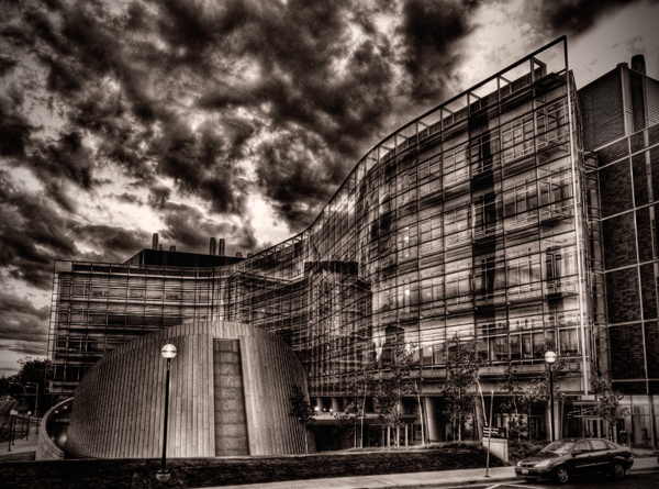
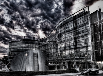
This image is of the Biomedical Sciences Research Building on the campus of The University of Michigan in Ann Arbor. I took this shot last summer (2007) as a series of exposures with the intent of creating an HDR. However, when I processed the multiple exposures I wasn't particularly happy with the way it came out. I didn't find any one of the series of images to be particularly compelling, although I did like the cloud formations. I decided to try some experimentation to see what I might coax out of the image. The building is an interesting structure, particularly the auditorium which is located in front of the building. Some people refer to this building as the 'pringle', in reference to Pringle's potato chips. I think this building has a slightly alien look to it, so I tried to create an image which had a 'otherworldly' feel to it.


The image to the left is the raw, unprocessed image. It is relatively flat, but has some potentially interesting color and texture in the clouds. I wanted to use something which would bring out the texture and shape. There is also some detail in the building itself but it is hidden in the dark.


In the layers pallette you can see that the number of processing steps was minimal. Since I had originally tried to create an HDR from multiple images, I decided to see what I could do if I used the Photomatix tonemapping plugin for Photoshop. I opened the plugin as a smart filter so I could go back later and make adjustments if I wanted to. The remaining steps were designed to improve the contrast just a bit, add some additional texture and tone.


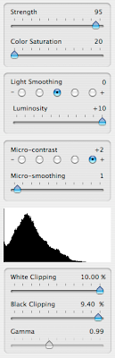
Above you can see the settings I used in the tone mapping plugin and the effect it had on the image. I used a high strength setting but desaturated the entire image. I wanted to bring out some of the light areas of the image so I set the light-smoothing to a mid value and luminosity to it's highest setting. In the contrast settings I wanted enhanced detail so I selected a high micro contrast, but I liked the look with the micro-smoothing set low. Finally I played with the white/black clipping levels to get an image that had the brightness levels I was looking for.


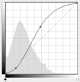
After finishing with the tone mapping I still didn't like the overall contrast in the image. I added a curves adjustment layer to get just a little more punch to the image. You can see the curve I used and the resulting change to the image above. After the curves layer, I made a minimal correction to the exposure and then put a true black and white layer since the tonemapping left just a bit of color in the image. I finished this particular image off with a 'platinum' toning curve (below) and a vignette to darken the edges.


As always comments, questions and constructive criticisms are welcome.


All images Copyright © 2008 James W. Howe


This image is available for purchase in my Color gallery on ImageKind.

Friday, June 27, 2008

'57 Imperial

'57 Imperial


This shot of a 1957 Chrysler Imperial was taken at the 2008 Eyes on Design car show held at the Edsel and Eleanor Ford Mansion in Grosse Pointe Shores, Michigan. The show itself is a fundraiser for the Detroit Institute of Ophthalmology. They had several cars in different age and style groups. I found this Chrysler Imperial to be particularly interesting. The color is typical '50s and the chrome on the car was beautiful. I really liked how the passenger side mirror combined with the antennae and shadow from the sun, created a nice abstract pattern of lines, shapes and colors.


As you can see from the image to the left, the original image lacked just a little bit of punch. Most of the processing was designed to bring out the color that I saw at the show and to emphasize the lines. Overall, processing on this shot was really quite minimal. I used Adobe Camera Raw to make some minor white balance adjustments along with enhancing the blacks just a bit. In Photoshop, I used a very simple curve to increase contrast. The chrome was reflecting a bit of the trees and grass so I added a HSL layer and desaturated the yellows and greens. This helped the chrome be more 'chromelike'. I also cropped the image just a bit to eliminate just a bit of the windshield wiper.


This shot was taken with an Olympus E-3 and a Digital Zuiko 14-54mm lens at f22. Zoom was at 29mm (58mm full frame equivalent). Shot at 1/80 at ISO 100.


Comments and constructive criticism are always welcome


This image is for sale at my Automobile Details gallery at ImageKind. I hope you check it out.

Saturday, June 21, 2008

Car Buff

Car Buff

I recently attended the 2008 Motor Muster held at Greenfield Village in Dearborn, Michigan. The show brought together more than 700 cars from the 30's through the 70's. I was there to take pictures of the automobiles. I'm not generally a people photographer. However, when I saw this little boy wandering around I just knew I had to get a shot of him.


I was just about done shooting for the day when I noticed him. He was walking around like he owned the place, very determined to get somewhere. He wasn't lost and his mother was nearby. I was using my 70-300 lens on my Olympus E-3 at the time (35mm effective focal length of 300-600mm) and I was trying to get a shot as he darted in and out of the spectators. I finally managed to get this show, along with a few more. I really liked this shot in particular because it really gives the feeling that this boy is very self-confident and knows exactly what he wants.


My goal in processing was to make sure that the boy was the center of attention. As you can see in the unprocessed image to the left, the boy is in focus, but the elements around him are only minimally out of focus. Even though I was using my 70-300, I was at 70mm f4 which doesn't provide the shallow DOF that I would have had if I had been at something like 300.

I did some basic processing in Camera Raw, adjusting white balance, exposure, etc. before launching Photoshop. Once in Photoshop my goal was to bring more attention to the boy. Since the other elements in the image were too sharp I decided to try the Focal Point Photoshop plugin by OnOne Software to see what I could do.


The Focal Point software lets you define the area of your image that you want sharp and lets you set different parameters for how much blur, type of blur, feathering of the blur, etc. It's all done with a control that they position over your image. You simple drag the focus point around, drag some points (similar to the way the pen tool works) to expand or contract the area of focus, and drag some different controls to set the blur type and amount. It's all very visual and quick. I'm not sure that I do this sort of work enough to warrant purchasing the product (I was using an evaluation copy) but it is definitely a slick product.


After getting the selective focus where I wanted, my next step was to darken everything except the boy. I used a curves adjustment layer in combination with a layer mask. I darkened the image and then used to mask to restore the original lightness level to the boy. I followed this up by using the Lens Correction tool to add an additional vignette to further darken the edges of the image. I then sharpened the image, but only the boy, I masked out any sharpening from the rest of the image.


At this point I thought I was done, but I still thought the other elements in the image were distracting from the boy so I made one more change. I added a black & white adjustment layer to desaturate the colors from everywhere except the boy. I then applied a mask to make sure that the boy was in color. The end result is what you see at the top.


Please feel free to leave comments, questions or constructive criticism and thanks for looking in

Sunday, June 1, 2008

City Body

City Body

This image was taken in the Depot Town area of Ypsilanti, Michigan. I was visiting the area to attend the annual Orphan Car Show held nearby. As I was walking to the show, I saw this sign. I really liked the vintage character of it. This part of town has some really nice old buildings and many of them have been rehabilitated.


I took this shot with my 70-300mm lens on my Olympus E-3. The 70-300 gives the equivalent focal length of 140-600. This particular shot was taken at 70mm (140mm).

Processing was fairly minimal. The original image, seen here to the left, was fairly flat, but was the light I shot it in was fairly flat as well. This side of the building was in shadow at the time I took. Processing consisted of initial work in Camera Raw, where I adjusted the white balance just a little bit and added some additional black.

After Camera Raw, I brought the image into Photoshop where I added a curves layer to increase the contrast. I followed that up by using an blank layer in Overlay mode where I did some burning to darken the edges. This also had the effect of bringing out a hint of red at the bottom of the image. The red came from a neon sign just out of the image frame. I finished up with some sharpening and the final result is what you see above.

I did experiment with a black & white version, but I found that I really preferred the color version. I think it's the combination of the red with the blue in the window along with the aging look of the paint on the building that makes it all work.


Comments, as always, are welcome.


If you like this image, and wish to purchase it, please visit my Color gallery at Allencreek Images. and feel free to check out my other galleries as well.