Saturday, September 29, 2007

Artistic License

Artistic License

This is a shot of a mid '40s Buick Eight automobile taken at the 2007 Concours d'Elegance auto show at Meadowboork Hall near Rochester Hill, Michigan. I have several nice shots from that show and after processing several, I decided to try something different with this particular image. One of the things that I noticed in the color original was the reflection on the front fender of a group of people standing near by. Normally I don't like seeing people reflections in this sort of shot, but I sort of liked the shape they made. I wanted to find some way to bring out the people, however 'normal' development (i.e. levels, contrast, etc.) didn't really work.


As part of an experiment, I played around with various filters just to see what effect they might have. This particular image was created by using a couple different 'threshold' filters which were used to reduce the image to its most abstract.


To the left is the image as it existed after I had done some processing to the raw file. The developed version had some more constrast, and additional corrections to bring out the proper color balance. From this starting point, I experimented with applying the threshold filter in order to create the very high constrast image seen above.


The first thing I did was add a Threshold filter adjustment layer. I slid the slider back and forth until I got the look I wanted. Too high of a value and the image was too dark and lost all detail, too low and the image was too light and without detail. For this image, a threshold of 77 seemed to look good, at least on part of the image. This threshold value did a good job of dealing with the top of the car, but it made the bottom almost completely white. As a result, I created a layer mask and masked out all but the very top. The key thing for me was keeping the headlight detail and also to keep the word 'Special' visible.


At this point I still wasn't quite happy with the way the top of the fender looked. I wanted to make sure I could see some of the curve and with the first threshold layer this area was pretty weak. I added a second threshold layer and used a value of 230. With this setting, the bottom of the image was mostly black so I masked out most of the bottom. Effectively I was putting a threshold on my threshold. It really only had the effect of adding some detail to the top of the front fender, up by the 'Special' emblem.


I created a third, and final, threshold adjustment layer using a value of 114. This did a nice job of bringing out the silhouettes of the people reflected in the fender. Overall I thought it did a nice job of abstracting the care without losing detail.


When I publish an image for the web I normally put some sort of simple border around it just to provide some separation between the image and the usual white background on which it is normally displayed. In this case I decided to leave the border off so that when displayed on a white background, the background would flow into the image. Similarly a black background has the same effect.

Wednesday, September 26, 2007

Happy 50th!

Happy 50th

This is a shot of the Mackinac Bridge which connects the lower peninsula of Michigan to the upper peninsula. The bridge is the 3rd largest suspension bridge in the world and the entire bridge is almost 5 miles long. This year is the 50th anniversary of the completion of the bridge.

This particular shot was taken on a late summer evening. I set my tripod up and aimed the camera at the bridge. I had a 45-150mm zoom lens (90-300 35mm equivalent) on the camera and I set the exposure for 60 seconds. During the exposure I counted to 10 and then zoomed out just a bit, waited another 10 counts and zoomed out a bit more until the timer closed the shutter. The water wasn't calm that night, so I didn't get nice reflections off of the water, but to me, the zoom effect makes the bridge almost look like fireworks bursting in the sky. Somehow I think it's appropriate for the 50th anniversary of the completion of the bridge.

Saturday, September 22, 2007

Red Belvedere

Red Belvedere

This image of a 1957 Plymouth Belvedere Convertible was taken at the 2007 Concours d'Elegance auto show held at Meadowbrook Hall in southeastern Michigan. There were hundreds of classic automobiles at this show ranging from very early to brand new. I love shooting older automobiles because they have such interesting details. Even cars that I may find ugly when seen in its entirety can have some really striking design elements. For this particular car, the first thing that struck me was the red paint and how I really liked how it contrasted with the chrome. I took several detail shots of this car, but I think this was the best.


The finished shot you see above is almost what came out of the camera, but I did make some adjustments in post processing which improved the image. The biggest change had to do with the chrome areas. For me the shot relies on the contrast between the red, the chrome and the black areas. In the original shot, however, the chrome had less of a silver color and more of a greenish cast. The green cast came from the fact that the car was parked on grass. The processing I did was designed to remove the green cast and ensure that the contrast between the red and the chrome matched the strong impression I had when I took the shot.


The first step I took was to use a curves adjustment layer to increase the contrast in the chrome areas. I used a moderate curve and then applied a layer mask so that the effect was limited to the chrome areas. The increase in contrast brought out some details in the headlight, as well as making some of the dark areas in the grille area a bit blacker.


The next step involved adjusting the saturation value in the chrome areas. I wanted to remove the greenish cast, but I didn't want to completely remove all color from the chrome areas. As you can see from the settings, I reduced, but did not eliminate the color. I also made a couple minor tweaks to the hue and lightness settings. I basically made minor changes to these settings until I had the color I was looking for. To ensure that the saturation only applied to the chrome, I used the same layer mask that I had used in the previous adjustment layer. I simply did an alt-drag on the layer mask to get it to apply to the new layer.


If you look at this image, you can see that the greenish cast is mostly gone, but there is still some color left in the chrome areas.


At this point I thought the image was looking pretty good, but I felt that the red was actually just a bit too harsh. Perhaps I didn't get the white balance just right or something, but it just looked a little too strong. Because of this, I decided to tone down the saturation just a little bit.


At this small size, it's probably hard to see the difference between the image above and this image, but the red has been toned down just a bit and the overall saturation is a little lower as well.


At this point I still wasn't quite satisfied with the red so I actually ended up adding back a little saturation to just the red portion of the image. I used a Hue/Saturation adjustment layer and selected 'Reds', bumping the saturation just a bit.


To finish the image, I applied some mild sharpening and created a simple border. If I were going to print this image, I would not use the border, but for publication to the web I felt that some border would be beneficial. I created the border by first expanding the canvas by 15 pixels using a white background, and then I expanded it again by .2 inches using a black background. When I add this sort of border, I like to use two thin borders. If the image is mostly dark, I'll just use a thin white and then a slightly wider black. If the image is fairly bright, I might use a thin black to 'contain' the image, and then add another thin white and then a thicker black. The border is added as a final step and I keep a borderless copy of my PSD file so that I can produce bordered or borderless images from the completed image.

Sunday, September 16, 2007

Taliesin Landscape - Compositing


This is a shot of a portion of the farmland at Taliesin, taken during a tour of the Wisconsin home of Frank Lloyd Wright. I was struck by the curves of the freshly cut fields and how they complimented the architecture of the house itself. Since I was on a tour, I didn't have much of a choice in when I took the shot, or have much time for composing the shot.

The day I was there, the weather was sunny and clear. It was mid-afternoon, and while the sky was blue, it was a somewhat muted blue. When I originally processed the file, I focused on the graphical nature of the farm fields. I decided a sepia-toned black & white suited the shot. However I wasn't completely happy with the final image. I decided that it would have been nice if there had been some clouds in the sky when I took the shot. Since there weren't any clouds in the sky, I decided to try to create a composite image which combined the landscape elements with a new sky.

In general I don't like doing composites, my feeling is that in photography an image should be created from what was there. I don't mind images that have had certain distracting elements removed, but I shy away from adding elements that weren't there. It is somehow disappointing to see a beautiful image and then find out that it was merely a construction. So, why did I do the composite? Mostly because I wanted to see if I could do one.


The shot you see here is the original, unprocessed, uncropped image. You can see that the light is moderately harsh and the sky has some blue but doesn't really provide much interest.


The first thing I did was play around with different croppings. I decided that a panoramic crop did the best job of capturing the curves in the field and removed extraneous elements. The image you see here is the starting point for the finished image.


When I took the shot, there was a row of vegetation between me and the fields. With the image cropped, a bit of that vegetation encroached on the image. I thought that this was distracting to the overall composition so I decided to clone that portion out of the image. In this case, the clone wasn't really adding something that wasn't there, it was just removing an object which was blocking what should have been visible in the first place. In this close-up, you can see the area that I needed to repair.


This next image shows the areas which received cloning using the Adobe Camera Raw 4.1 clone tool. With this tool, you draw circles and the tool selects an area it thinks is similar. Since I wanted to get rid of the bush, I simple selected pixels from the grassy area nearby. These pixels were consistent with what would have been visible if the bush hadn't been in the way.


The next step for me was to find a sky image that would suit the image. Recently at home there was a late afternoon sky which I thought would work, so I took a drive out of town to find an open skyline which was similar to what I had taken at Taliesin. The time of day was a little later than when I took the shot at Taliesin, but the angle of the sun was reasonably close. I took shots both to the north and south. At Taliesin the original shot was toward the south. After looking at my shots, I decided that the one taken toward the north looked nicer.


By selecting the northern shot, I created a minor problem for myself. Since the Taliesin image was taken toward the south in late afternoon, shadows would be cast to the left. However, the northern sky would have shadows on the clouds on the right. Fortunately this was a fairly easy problem to deal with. I took the original of the sky image, cropped and stretched it to fit the Taliesin image. I then did an Edit->Transform on the layer and reversed the image so the direction of the sun would more closely match the direction of the sun at Taliesin.


Having selected my sky image, I then placed the sky image on it's own layer. Reducing the opacity, I used the Move tool to drag the horizon line to a reasonable place in the main image. Once that was done I then created a layer mask and proceeded to mask out the bottom of the sky image to let the main image show through.


Once the basic composite was complete the next step involved improving the quality of the combined images. The first thing I did was do a minor contrast adjustment.


The next step was to use a black & white adjustment layer to create the sepia toned image. I adjusted things in this layer so that the curves of the field stood out. I then added a fairly strong sepia tone to the image. I particularly liked the way the sepia made the tree leaves look.


The final touch before completing the image was to add a subtle vignette. For the vignette, I used a technique described in the book The Photoshop CS2 Book for Digital Photographers, by Scott Kelby. I created a new layer and filled it with black. I then used the rectangular marquee tool to create a selection. I used the refine edge and used a large feather value to create a very large but diffuse selection. I hit delete to knock the center out of the selection and was left with the vignette.


To complete the image, I resized, sharpened and gave it a simple border. The border was created by extending the canvas with a thin white band and then expanding again with a slightly thicker black band. The final result is what you see at the top of the article.

Saturday, September 15, 2007

The Flower in the Crannied Wall

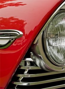
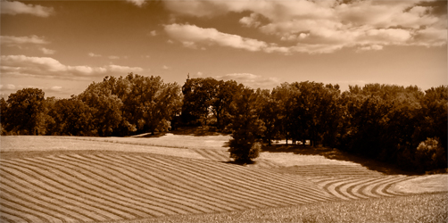
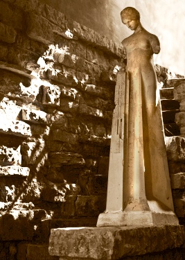
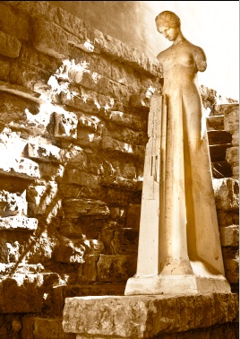
This image was taken at Taliesin, the Wisconsin home of Frank Lloyd Wright. The sculpture in the picture is known as "The Flower in the Crannied Wall", and is a copy of a sculpture done for another of Wright's houses. This particular sculpture used to be displayed in a more exposed area and as such suffered damage, particularly to the arms. The sculpture was moved to a more sheltered space several years ago.

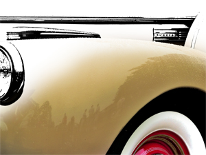
I took this image while on a tour of Taliesin, and as such I didn't have a lot of time to spend composing my shot. I also was pretty much stuck with whatever lighting there was. Fortunately the tour took place in mid-afternoon, and it happened that the sun was coming through a doorway right behind the statue, creating some nice lighting on the stone. The angle and intensity of the light made for a difficult exposure. When I took the shot, I was thinking that it would make a nice black & white image. However, once I starting working with the image, I felt that a slight sepia tone would fit it better. What follows is a basic description of how I went from the unprocessed image file to the one you see above.


Straighten and Repair


In working with the image, the first thing I did was open the image in Adobe Camera Raw 4.1. I did some mild exposure related changes to the image, but the biggest changes were to straighten the image and to do something about the open doorway above the head of the statue. Straightening the image was fairly simple. I used the ACR straighten tool and drew a line across the bottom of the statue. This resulted in a slight rotation of the image which made everything look a little better.

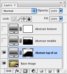
In order to get rid of the open doorway, I used the clone tool of ACR to copy portions of the wall to the area where the doorway was. The clone tool in ACR is quite nice, you create a circle around the area you want to replace and ACR finds another area of the image which it thinks matches. You can move the suggestion around, and as you do you see how the clone will look in real time. I ended up doing several clone actions to block out the doorway. Fortunately, the wall itself has a sort of rough plaster coating and the clone ended up doing a fairly good job. Once this was done, I opened the image as a Smart Object in Photoshop CS3. The clone left some artifacts and I cleaned this up somewhat by creating a new layer and using the Blur tool to blur out the artifacts.
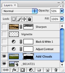
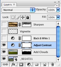
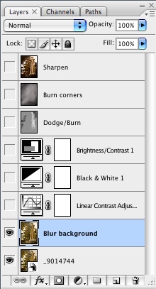


Add Contrast

After cleaning up the wall a bit, I experimented with adding a little contrast to the image. After some experimentation I decided that using the preset 'Linear Contrast' (in CS3) gave me the best look. This option creates a very shallow S curve.


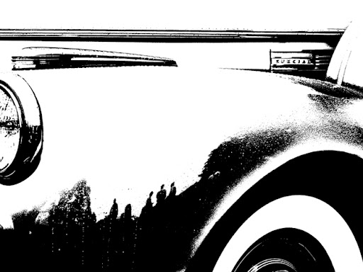
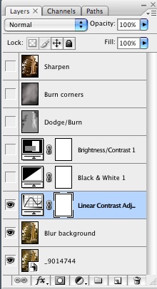
Convert to Black & White


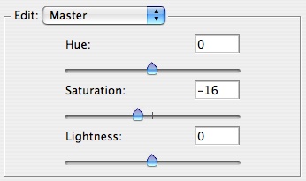
The next step involved converting the image from color to black & white. I used a Black & White adjustment layer and adjusted the sliders to get a look I liked. Mostly I darkened the upper left and lower right corners and tried to lighten the statue up a bit. I used the feature in CS3 which lets you click on an area of the image and drag left or right to darken or lighten the pixels which are in the same color range. As a final step, I used the Tint option to add a slight sepia tone to the image. The color version was already almost sepia and I liked the slight tone better than a straight black & white.


Tweak the Brightness & Contrast


After the conversion to black & white I still wasn't completely happy with the contrast in the image. I decided to try the Brightness and Contrast adjustment layer to add just a bit more of each to the image. I think the change brought out just a bit more detail in the statue.
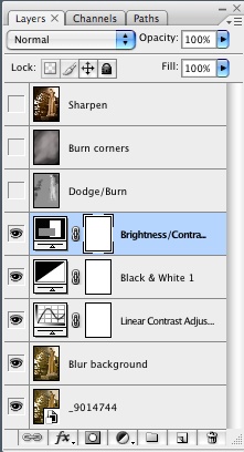
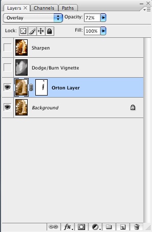


Dodge and Burn

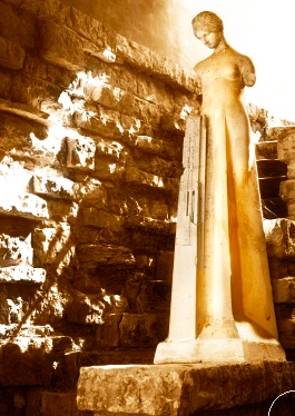
At this point I thought that some of the areas of the image were too dark. In order to lighten them, I created a dodge and burn layer. I used a technique that I found described in Scott Kelby's book, Photoshop CS2 For Photographers. I created a new layer by selecting New Layer from the Layers menu. I chose the Overlay blending mode and selected the 'Fill with 50% gray' option. I then selected a soft brush and set the opacity fairly low, maybe around 15%. I would select a white brush for places I wanted to be lighter, and a black brush for areas I wanted to darken. Since the opacity level was low I could control the amount of the effect by making multiple passes over the image. If you look at the Layers Palette, any area which isn't mid-gray received some treatment. Light areas were made lighter (dodged), dark areas were made darker (burned). If you look closely, you will see that the statue was made a little brighter, and a spot on the wall where the sun was hitting the hardest was made a little darker.


I was happy with how the statue and the sunny parts of the wall were looking for the most part, but I wanted to strengthen the contrast between the sunlit parts of the wall and the more shaded areas. I wanted to really emphasize the light which was coming in behind the statue. To acheive this, I created another dodge/burn layer and this time I did some additional burning in the upper left and lower right corners. Again, if you look at the Layers Palette you can see the areas that received burning or dodging.


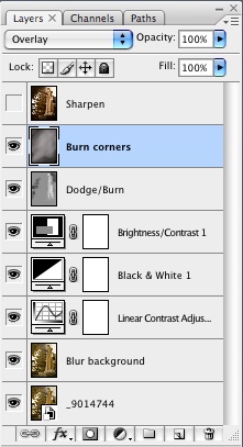
Creating the 'Orton' Effect

The next step involved adding an 'Orton' effect to the image. This technique was originally developed for use with slides, where a slightly overexposed slide would be combined with a blurry slide to create an image with bolder look. Using a technique described here I tried to do the same thing for this image.

The first step involved taking the image and duplicating it. After duplicating it, I used 'Apply Image' with an overlay mode of Screen to create a slightly overexposed version of the image.


Once I had my overexposed image, I created a duplicate of the overexposed image. This duplicate was my blurry image. I used a Gaussian blur on the image with a radius of about 50. Once I had the blurred image, I used the Move tool (V) and did a shift-drag of the blurred image onto the overexposed image. I also switched the blend mode to Overlay.

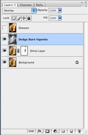
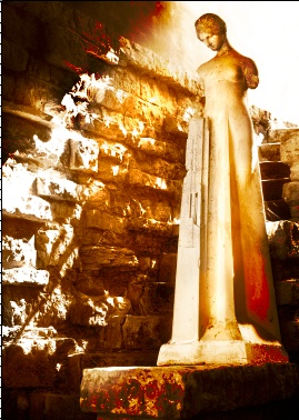
For the most part I liked the Orton effect, but I didn't like the way it reduced the sharpness of the statue itself. In order to counteract this, I created a layer mask to remove some of the effect over the statue area. If you look carefully at the mask, you can see the areas where I masked out the Orton effect.


I still wasn't quite satisfied with the look. I wanted more of the focus to be on the statue, so I added a Dodge/Burn layer, using the technique described earlier, and darkened areas around the statue to create more of a vignette. If you look at the layer mask, you can see the areas that I darkened and those that I lightened.


To finish the image, I did some final sharpening and added a simple border. The border was created by extending the canvas by about 10 pixels using a white background and then extending the canvas again about .15 inches using a black background.