This is a shot of a portion of the farmland at Taliesin, taken during a tour of the Wisconsin home of Frank Lloyd Wright. I was struck by the curves of the freshly cut fields and how they complimented the architecture of the house itself. Since I was on a tour, I didn't have much of a choice in when I took the shot, or have much time for composing the shot.
The day I was there, the weather was sunny and clear. It was mid-afternoon, and while the sky was blue, it was a somewhat muted blue. When I originally processed the file, I focused on the graphical nature of the farm fields. I decided a sepia-toned black & white suited the shot. However I wasn't completely happy with the final image. I decided that it would have been nice if there had been some clouds in the sky when I took the shot. Since there weren't any clouds in the sky, I decided to try to create a composite image which combined the landscape elements with a new sky.
In general I don't like doing composites, my feeling is that in photography an image should be created from what was there. I don't mind images that have had certain distracting elements removed, but I shy away from adding elements that weren't there. It is somehow disappointing to see a beautiful image and then find out that it was merely a construction. So, why did I do the composite? Mostly because I wanted to see if I could do one.
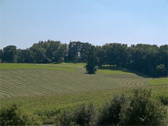
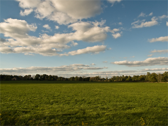
The shot you see here is the original, unprocessed, uncropped image. You can see that the light is moderately harsh and the sky has some blue but doesn't really provide much interest.
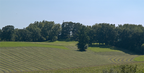
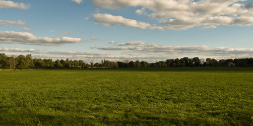
The first thing I did was play around with different croppings. I decided that a panoramic crop did the best job of capturing the curves in the field and removed extraneous elements. The image you see here is the starting point for the finished image.
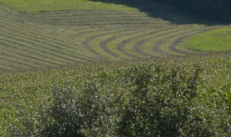
When I took the shot, there was a row of vegetation between me and the fields. With the image cropped, a bit of that vegetation encroached on the image. I thought that this was distracting to the overall composition so I decided to clone that portion out of the image. In this case, the clone wasn't really adding something that wasn't there, it was just removing an object which was blocking what should have been visible in the first place. In this close-up, you can see the area that I needed to repair.
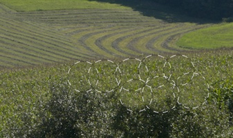
This next image shows the areas which received cloning using the Adobe Camera Raw 4.1 clone tool. With this tool, you draw circles and the tool selects an area it thinks is similar. Since I wanted to get rid of the bush, I simple selected pixels from the grassy area nearby. These pixels were consistent with what would have been visible if the bush hadn't been in the way.
The next step for me was to find a sky image that would suit the image. Recently at home there was a late afternoon sky which I thought would work, so I took a drive out of town to find an open skyline which was similar to what I had taken at Taliesin. The time of day was a little later than when I took the shot at Taliesin, but the angle of the sun was reasonably close. I took shots both to the north and south. At Taliesin the original shot was toward the south. After looking at my shots, I decided that the one taken toward the north looked nicer.
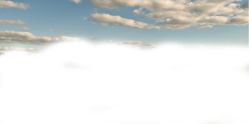
By selecting the northern shot, I created a minor problem for myself. Since the Taliesin image was taken toward the south in late afternoon, shadows would be cast to the left. However, the northern sky would have shadows on the clouds on the right. Fortunately this was a fairly easy problem to deal with. I took the original of the sky image, cropped and stretched it to fit the Taliesin image. I then did an Edit->Transform on the layer and reversed the image so the direction of the sun would more closely match the direction of the sun at Taliesin.
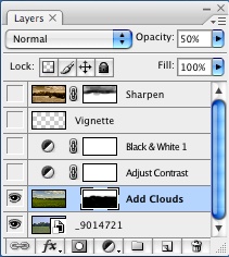
Having selected my sky image, I then placed the sky image on it's own layer. Reducing the opacity, I used the Move tool to drag the horizon line to a reasonable place in the main image. Once that was done I then created a layer mask and proceeded to mask out the bottom of the sky image to let the main image show through.
 |  |
Once the basic composite was complete the next step involved improving the quality of the combined images. The first thing I did was do a minor contrast adjustment.
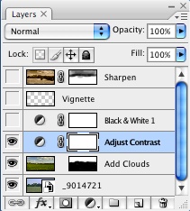 | 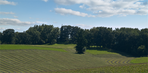 |
The next step was to use a black & white adjustment layer to create the sepia toned image. I adjusted things in this layer so that the curves of the field stood out. I then added a fairly strong sepia tone to the image. I particularly liked the way the sepia made the tree leaves look.
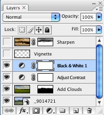 | 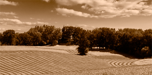 |
The final touch before completing the image was to add a subtle vignette. For the vignette, I used a technique described in the book The Photoshop CS2 Book for Digital Photographers, by Scott Kelby. I created a new layer and filled it with black. I then used the rectangular marquee tool to create a selection. I used the refine edge and used a large feather value to create a very large but diffuse selection. I hit delete to knock the center out of the selection and was left with the vignette.
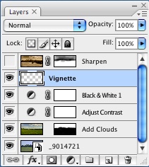 | 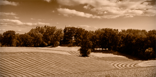 |
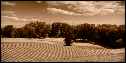
To complete the image, I resized, sharpened and gave it a simple border. The border was created by extending the canvas with a thin white band and then expanding again with a slightly thicker black band. The final result is what you see at the top of the article.


No comments:
Post a Comment