Thursday, March 27, 2008

St. Patrick's Cathedral (NYC)

Saint Patrick's Cathedral NYC

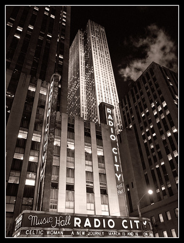
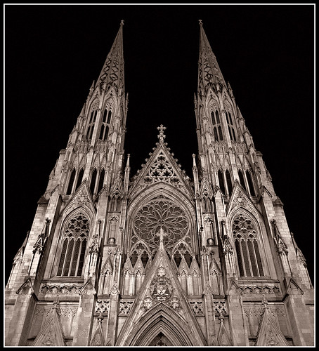
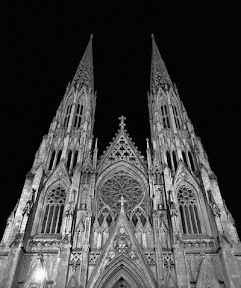
This is a shot of St. Patrick's Cathedral in New York City. I was in New York on business and I managed to find some time to walk around the Rockefeller Center area one evening. Since I was traveling fairly light, I didn't have a tripod with me, so all my night shots had to be hand held. As I was walking around the area I noticed St. Patrick's and was really taken with the way it was lit. Lights from below were creating sharp shadows in all the detail areas of the building. I really liked the high contrast. Unfortunately the cathedral was undergoing some work at ground level so I decided to just capture the upper area. The image you see above has had some work done to it, mostly dodging and burning, but there are some additional 'corrections' I made to improve the image (at least to my eye)


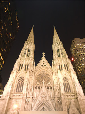
To the left you can see the image as it came out of the camera. The shot was probably a little overexposed, but I was surprised at how much information I was able to recover. I had another shot which was a little darker to begin with, but I preferred this angle.


Some thing you might notice in the original, besides being brighter, is that there are buildings on either side of the church. When I was working on the image, I decided that the focus should be on the cathedral itself, not just a cityscape. The buildings were architecturally different and certainly darker than the main subject, so I decided to just eliminate them entirely.


Another thing you might notice is at the bottom of the original image. There was a protective canopy over the entrance which you can just see the top of in the original. I decided to crop it out. At the same time, I also took out some of the sky. Another change involves the bright spotlight in the lower left area of the image. When I originally worked on the shot I left this in, mostly because I couldn't think of a way to remove it without messing up the image. Later, as I'll describe, I figured out something which worked pretty well


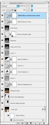
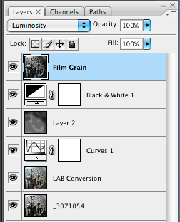
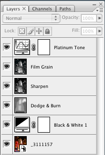
Here you see the full layers palette from the finished image. As you can see, there are quite a few layers. Many of the layers are there to deal with the lighting of the building. Others are for doing some minor perspective correction and removing objectionable material (background buildings, bright light)


I started with Camera Raw and adjusted the exposure to darken the image, and I used the 'blacks' slider to add a bit more character to the image. I then opened the image in Photoshop.


My next step was to do some minor perspective corrections. I used the Lens Correction tool to adjust for some barrel distortion (not much). I noticed that the steeple's did not appear to be the same height, probably due to the angle at which I took the shot. It wasn't off by much, but it bothered me that the distance from the top of the image to the top of each steeple wasn't the same. I took my selection tool and selected part of the right steeple and put it on its own layer. I then stretched it just a little bit so that the top matched the top of the other one. I then cloned out the other buildings and created a new merged layer for further work.


My next task was to do some work on the lighting of the building itself. The cathedral was lit with some very strong lights and some areas were just naturally brighter than others and I didn't want to eliminate that, but I also didn't want there to be so much contrast between the lighter and darker areas that it became a distraction. I noticed that the background was not quite black, and since I had done some cloning to remove the buildings, I decided to add a curves layer which made most of the background black (or nearly so). This helped remove any cloning artifacts. I then added a dodge/burn layer in a first attempt to even out the lighting. The process I used for my dodge/burn layers was to create a new layer in Soft Light mode, fill it with 50% gray and then paint with white/black at a low opacity and build up or reduce the exposure using multiple passes with the brush. I did some more adjustments while still in color mode before converting to black & white. After the conversion I once again did some more dodging and burning.


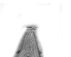
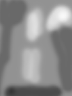
At this point the image was close to what I wanted. However, there was still too much of the construction canopy visible, so I cropped the image. I was still bothered by the bright light on the left (seen in the original image) but I couldn't think of a reasonable way to do it. After some more thought, I figured I would try to patch from the right side of the image. I made a selection of the lower right gable roof area. I then copied this to its own layer. Once there, I flipped it horizontally to create a mirror image. I reduced the opacity so that the background image was partially visible. I then took the move tool and moved the image over to the left until it covered the gable on the left. To my surprise it was almost a perfect fit. I edited the layer mask to reduce the size of the patch to a minimum. The patch ended up being what you see to the left. Below, you can see the difference that the patch made:


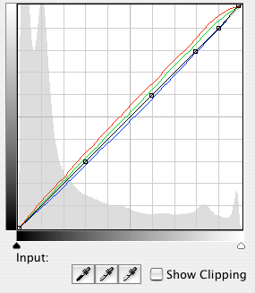
The remainder of the work involved adding some film grain using the channel noise technique I've described before. I also added a curve to give the image a platinum tone. I did one final curves adjustment to again make the background a little blacker. I found that the background had too much color and noise after the previous adjustments and I wanted to make sure it was black. The final result is what you see at the top of the post.


I'm sure that if I were better at Photoshop I would have been able to do this work in fewer steps, but overall I'm pleased with how it came out. I had this image printed by Mpix on their metallic paper and the combination of the platinum color and the metallic paper made for a very interesting finished image.


As always, comments and constructive criticisms are welcome


This image (and others) are for sale at my ImageKind gallery.

Tuesday, March 18, 2008

Power

Power

This image was taken at The Henry Ford Museum in Dearborn, Michigan. The museum has an enormous collection of interesting items ranging from very small to the very large. This image was taken in a section of the museum devoted to power generation and machines. The museum has several large generators, many of them steam operated, in it's collection.

This particular image is a close up of one of the larger generators. I was attracted to it by the interesting gears it used as well as just the shear size of the thing. When I took the shot, I planned on converting the image to black & white. The machine itself, as you can see below, was primarily battleship gray, so there wasn't much color to begin with. There was a hint of color in the gears, either rust or exposed brass, but I didn't think that contributed much to the image.


The image to the left is the shot as it came out of the camera. I took this with an Olympus E-3 which has a 4/3 image factor. When I was working with the image, I felt that a squarer crop would work better. I decided the focus should be more on the gears which attracted me in the first place, so I trimmed the excess from the right side of the image.


Here you can see the layers palette for the final image. I started with the image from Adobe Camera Raw and made minor adjustments before opening the file in Photoshop.

The next step was a bit of an experiment. I have seen some videos and have been reading a book by Dan Margulis on the LAB color mode. One of the strengths of LAB is the ability to separate similar colors. In my image I had some metallic tones which had more color variation than existed in the captured image. I decided to try a couple of simple LAB curves on the A and B channels to see if I could get more separation. I don' t have a before/after image to show you, but it did bring out some additional color. My thinking was that this might help increase the tonality in the conversion to black & white. Don't know if it worked, but it didn't hurt!

The next step was to perform a simple curves adjustment. Primarily I just increased the contrast a bit by using a slight S-curve. One thing this did was to darken the area behind the generator a little more so you don't really notice it.

After that, it was time to do some dodging and burning. I created a new layer, set to overlay, and filled with 50% gray. I used a soft brush at a low opacity to brush in some additional highlights and to darken some areas. In particular, I darkened the part of the generator in the background. I liked how it gave it a darker, almost oily appearance.

The next step was the actual black and white conversion. I started with the default settings and clicked in areas of the image that I wanted lighter or darker and move the mouse right or left as needed.

The final step was to add a layer to simulate film grain. Once again I used a technique described by Katrin Eismann for adding slightly blurred noise to each of the RGB channels independently, using Luminosity mode to remove any color side affects. With the addition of a border around the image, the result is what you see at the top of this article.

Comments, criticisms and questions welcome.

Saturday, March 15, 2008

Radio City

Radio City

This is a shot of Radio City Music Hall in New York City. The tall building In the background is 30 Rockefeller Center. I was in New York on business and decided to walk to Rockefeller Center to take some shots. I didn't have a tripod with me, so some of the night shots didn't work out. This one, however, was one of my favorites.

I took this shot from across the street. I found a place where I could sit to get better stability. The shot was taken at a 35mm effective focal length of 28mm for 1/5 of a second. The image stabilization feature of my Olympus E-3 did a nice job keeping the image sharp.

When I took the shot I was thinking about the color of the signage. When I processed the shot, however, I wondered if a black & white image might not be more fitting.


Here you see the unprocessed, color version. I like the various colors caused by the lights used to illuminate the buildings. Radio City Music Hall is obviously more red because of the signage. In the background, 30 Rockefeller Center is more white because they use a strong white light to light up the building. The color image is nice, and I may do more with it later, but I really think the subject matter works better in black & white.


The conversion to black & white was fairly straight forward. I didn't spend a large amount of time on tweaking parts of the image. As you can see from the layers palette the basic steps were:

  1. Add a black & white adjustment layer
  2. Do some dodging and burning
  3. Sharpen the image
  4. Add some film grain
  5. Add a platinum tone


When I did the conversion to black & white, I was looking to create some additional contrast. I wanted the light buildings to be lighter, and I wanted to the dark buildings to be a little darker. I also wanted to make sure that the steam was visible. The black & white conversion layer primarly has adjustments to the red and yellow components. The red is -16% and the yellow was set to 107%. I did this mostly by clicking on the image and dragging in the areas that I wanted to make lighter or darker.


To do the dodging and burning, I added a new layer set to Overlay mode and filled with 50% gray. I used a relatively soft brush, set to a low opacity, and simply painted over the areas that I wanted brighter or darker. To make the area brighter, I chose white as my brush color, to make it darker, I chose black. By using a low opacity, I was able to better control the effect. I could paint over an area, and if it wasn't bright enough, I could paint again.


After getting the image about where I wanted it, I decided to sharpen. I knew I was going to add some film grain and I didn't want the sharpen the grain itself (although that may have looked nice as well). I used the Unsharp Mask filter and used a moderate level of sharpening.


One problem I have with digital black & white images is that they can be too 'clean'. With b&w film, you could use the grain characteristics to enhance the image. I decided that for a more 'vintage' look I would add some film grain. I used a technique described by Katrin Eismann in one of her videos available at www.kelbytraining.com. Her technique is to add some noise to each of the channels, along with a slight blur.


I started by viewing the channels and selecting the blue channel. I then selected Filter->Noise->Add Noise and used a value of 8% gaussian. After that, I applied a gaussian blur of 0.3 pixels. I repeated this process for the green channel, reducing the noise to 6% (but using the same amount of blur) and finally for the red channel where I used 4%. After making these changes on their own layer, I set the layer mode to luminosity to get rid of the color artifacts. I think this process works quite well.


The final step was to add a bit of toning to the image. The pure black & white looked nice, but I really like the look of platinum prints and I thought that would work well with this image. I had found some pre-built curves on the web, one of which reproduces the look of a platinum print. You can see by looking at the curve that a bit of green and red was added and blue was taken away. The final steps were to add a simple black border around the image and the final result is what you see at the top