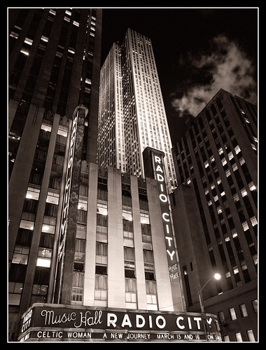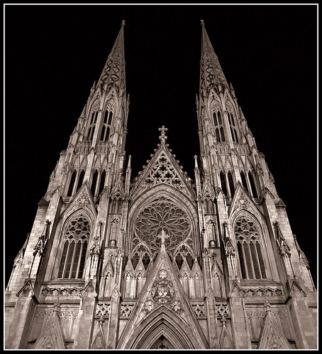
This is a shot of St. Patrick's Cathedral in New York City. I was in New York on business and I managed to find some time to walk around the Rockefeller Center area one evening. Since I was traveling fairly light, I didn't have a tripod with me, so all my night shots had to be hand held. As I was walking around the area I noticed St. Patrick's and was really taken with the way it was lit. Lights from below were creating sharp shadows in all the detail areas of the building. I really liked the high contrast. Unfortunately the cathedral was undergoing some work at ground level so I decided to just capture the upper area. The image you see above has had some work done to it, mostly dodging and burning, but there are some additional 'corrections' I made to improve the image (at least to my eye)
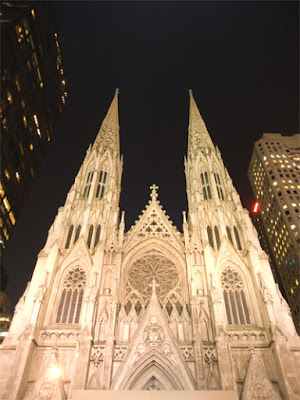
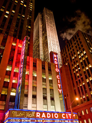
To the left you can see the image as it came out of the camera. The shot was probably a little overexposed, but I was surprised at how much information I was able to recover. I had another shot which was a little darker to begin with, but I preferred this angle.
Some thing you might notice in the original, besides being brighter, is that there are buildings on either side of the church. When I was working on the image, I decided that the focus should be on the cathedral itself, not just a cityscape. The buildings were architecturally different and certainly darker than the main subject, so I decided to just eliminate them entirely.
Another thing you might notice is at the bottom of the original image. There was a protective canopy over the entrance which you can just see the top of in the original. I decided to crop it out. At the same time, I also took out some of the sky. Another change involves the bright spotlight in the lower left area of the image. When I originally worked on the shot I left this in, mostly because I couldn't think of a way to remove it without messing up the image. Later, as I'll describe, I figured out something which worked pretty well
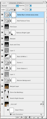
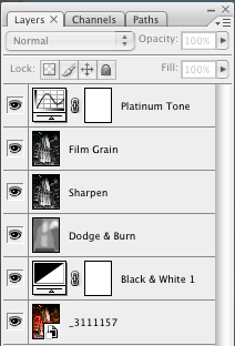
Here you see the full layers palette from the finished image. As you can see, there are quite a few layers. Many of the layers are there to deal with the lighting of the building. Others are for doing some minor perspective correction and removing objectionable material (background buildings, bright light)
I started with Camera Raw and adjusted the exposure to darken the image, and I used the 'blacks' slider to add a bit more character to the image. I then opened the image in Photoshop.
My next step was to do some minor perspective corrections. I used the Lens Correction tool to adjust for some barrel distortion (not much). I noticed that the steeple's did not appear to be the same height, probably due to the angle at which I took the shot. It wasn't off by much, but it bothered me that the distance from the top of the image to the top of each steeple wasn't the same. I took my selection tool and selected part of the right steeple and put it on its own layer. I then stretched it just a little bit so that the top matched the top of the other one. I then cloned out the other buildings and created a new merged layer for further work.
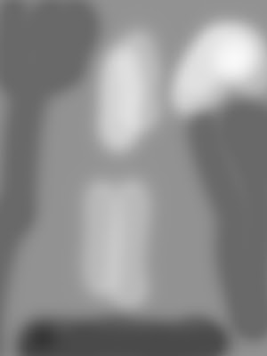
My next task was to do some work on the lighting of the building itself. The cathedral was lit with some very strong lights and some areas were just naturally brighter than others and I didn't want to eliminate that, but I also didn't want there to be so much contrast between the lighter and darker areas that it became a distraction. I noticed that the background was not quite black, and since I had done some cloning to remove the buildings, I decided to add a curves layer which made most of the background black (or nearly so). This helped remove any cloning artifacts. I then added a dodge/burn layer in a first attempt to even out the lighting. The process I used for my dodge/burn layers was to create a new layer in Soft Light mode, fill it with 50% gray and then paint with white/black at a low opacity and build up or reduce the exposure using multiple passes with the brush. I did some more adjustments while still in color mode before converting to black & white. After the conversion I once again did some more dodging and burning.
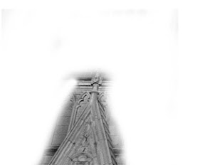
At this point the image was close to what I wanted. However, there was still too much of the construction canopy visible, so I cropped the image. I was still bothered by the bright light on the left (seen in the original image) but I couldn't think of a reasonable way to do it. After some more thought, I figured I would try to patch from the right side of the image. I made a selection of the lower right gable roof area. I then copied this to its own layer. Once there, I flipped it horizontally to create a mirror image. I reduced the opacity so that the background image was partially visible. I then took the move tool and moved the image over to the left until it covered the gable on the left. To my surprise it was almost a perfect fit. I edited the layer mask to reduce the size of the patch to a minimum. The patch ended up being what you see to the left. Below, you can see the difference that the patch made:
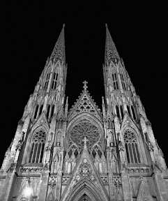 | 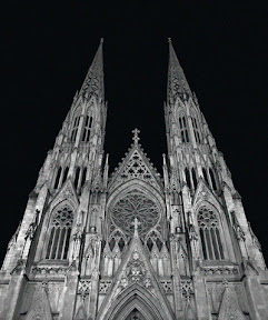 |
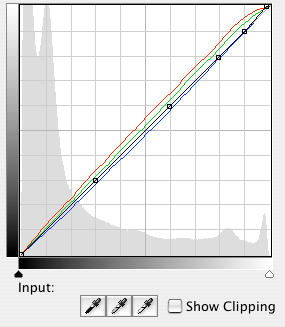
The remainder of the work involved adding some film grain using the channel noise technique I've described before. I also added a curve to give the image a platinum tone. I did one final curves adjustment to again make the background a little blacker. I found that the background had too much color and noise after the previous adjustments and I wanted to make sure it was black. The final result is what you see at the top of the post.
I'm sure that if I were better at Photoshop I would have been able to do this work in fewer steps, but overall I'm pleased with how it came out. I had this image printed by Mpix on their metallic paper and the combination of the platinum color and the metallic paper made for a very interesting finished image.
As always, comments and constructive criticisms are welcome
This image (and others) are for sale at my ImageKind gallery.