
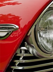
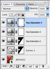
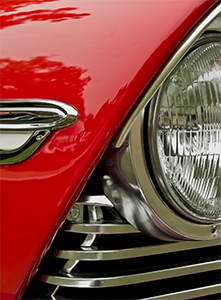
This image of a 1957 Plymouth Belvedere Convertible was taken at the 2007 Concours d'Elegance auto show held at Meadowbrook Hall in southeastern Michigan. There were hundreds of classic automobiles at this show ranging from very early to brand new. I love shooting older automobiles because they have such interesting details. Even cars that I may find ugly when seen in its entirety can have some really striking design elements. For this particular car, the first thing that struck me was the red paint and how I really liked how it contrasted with the chrome. I took several detail shots of this car, but I think this was the best.
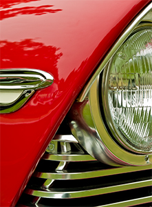
The finished shot you see above is almost what came out of the camera, but I did make some adjustments in post processing which improved the image. The biggest change had to do with the chrome areas. For me the shot relies on the contrast between the red, the chrome and the black areas. In the original shot, however, the chrome had less of a silver color and more of a greenish cast. The green cast came from the fact that the car was parked on grass. The processing I did was designed to remove the green cast and ensure that the contrast between the red and the chrome matched the strong impression I had when I took the shot.
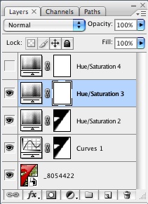
The first step I took was to use a curves adjustment layer to increase the contrast in the chrome areas. I used a moderate curve and then applied a layer mask so that the effect was limited to the chrome areas. The increase in contrast brought out some details in the headlight, as well as making some of the dark areas in the grille area a bit blacker.
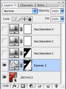
The next step involved adjusting the saturation value in the chrome areas. I wanted to remove the greenish cast, but I didn't want to completely remove all color from the chrome areas. As you can see from the settings, I reduced, but did not eliminate the color. I also made a couple minor tweaks to the hue and lightness settings. I basically made minor changes to these settings until I had the color I was looking for. To ensure that the saturation only applied to the chrome, I used the same layer mask that I had used in the previous adjustment layer. I simply did an alt-drag on the layer mask to get it to apply to the new layer.
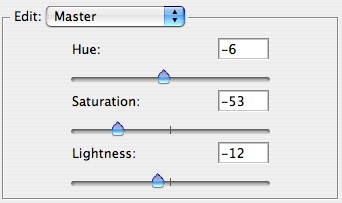

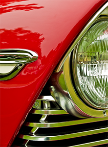
If you look at this image, you can see that the greenish cast is mostly gone, but there is still some color left in the chrome areas.
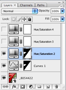
At this point I thought the image was looking pretty good, but I felt that the red was actually just a bit too harsh. Perhaps I didn't get the white balance just right or something, but it just looked a little too strong. Because of this, I decided to tone down the saturation just a little bit.
At this small size, it's probably hard to see the difference between the image above and this image, but the red has been toned down just a bit and the overall saturation is a little lower as well.
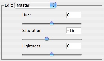
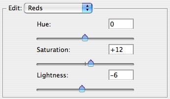
At this point I still wasn't quite satisfied with the red so I actually ended up adding back a little saturation to just the red portion of the image. I used a Hue/Saturation adjustment layer and selected 'Reds', bumping the saturation just a bit.
To finish the image, I applied some mild sharpening and created a simple border. If I were going to print this image, I would not use the border, but for publication to the web I felt that some border would be beneficial. I created the border by first expanding the canvas by 15 pixels using a white background, and then I expanded it again by .2 inches using a black background. When I add this sort of border, I like to use two thin borders. If the image is mostly dark, I'll just use a thin white and then a slightly wider black. If the image is fairly bright, I might use a thin black to 'contain' the image, and then add another thin white and then a thicker black. The border is added as a final step and I keep a borderless copy of my PSD file so that I can produce bordered or borderless images from the completed image.


No comments:
Post a Comment